


What are neutral colors? This exploration delves into the fascinating world of neutrals, encompassing grays, beiges, browns, blacks, and whites. We’ll uncover their psychological impact, historical significance, and practical applications in design, fashion, art, and visual communication. Prepare to be inspired by the versatility and enduring appeal of these timeless hues.
From the calming effect of gray in architecture to the sophisticated elegance of black in fashion, neutral colors offer a foundation for countless creative expressions. Understanding their nuances allows us to appreciate the subtle shifts in mood and ambiance they can create. This exploration will guide you through the key characteristics of neutral colors, showcasing their diverse applications and providing practical insights into their use in various fields.
Defining Neutral Colors

Neutral colors, a cornerstone of design and art, are hues that lack strong, vibrant characteristics. They often evoke a sense of calm, stability, and versatility, making them highly adaptable across various contexts. These colors serve as a foundation upon which other colors can be built, creating a balanced and harmonious aesthetic. Understanding their nuances, from their psychological impact to their historical significance, is crucial for anyone working with color.Neutral colors are not simply a lack of color, but rather a specific set of hues that, in their subdued intensity, create a sense of neutrality.
They act as a backdrop for other colors, allowing them to stand out and highlighting their unique qualities. The historical and cultural interpretations of neutral colors further underscore their complexity and the diverse ways in which they are perceived across different societies.
Defining Neutral Colors: A Concise Overview
Neutral colors are hues that do not possess a strong, vibrant, or noticeable color characteristic. They typically include various shades of gray, beige, brown, black, and white. These colors are often associated with a sense of calmness, neutrality, and stability. Their lack of strong emotional connotations makes them versatile, enabling them to blend seamlessly with a wide range of other colors.
Psychological and Emotional Associations
Neutral colors evoke a range of psychological and emotional responses. Gray, for example, is often associated with sophistication, calmness, and neutrality. White, on the other hand, symbolizes purity, cleanliness, and innocence. Beige and brown evoke a sense of earthiness, stability, and comfort. Black often signifies power, elegance, and sophistication.
These associations are not universal but are commonly observed across cultures.
Historical Context in Art, Design, and Fashion
Neutral colors have played a significant role in art, design, and fashion throughout history. In ancient civilizations, natural pigments like ochre and umber were often used to create earthy neutral tones. The use of white and black in ancient Greek and Roman pottery and architecture exemplifies the historical importance of neutrals. In modern times, neutral palettes have become increasingly popular in fashion and interior design due to their versatility and ability to create a timeless aesthetic.
Cultural Interpretations of Neutral Colors, What are neutral colors
The interpretation of neutral colors can vary across cultures. While white often symbolizes purity in Western cultures, in some Eastern cultures, it can be associated with mourning. Black, often signifying formality and sophistication in the West, can be associated with mourning or bad luck in other parts of the world. Understanding these cultural nuances is essential when using neutral colors in design and communication.
Distinguishing Neutral Colors from Non-Neutral Colors
Neutral colors are characterized by their lack of strong color saturation. They lack the vibrant intensity of primary and secondary colors. Non-neutral colors, in contrast, possess a defined and noticeable color saturation. This characteristic differentiates them from the more subtle and subdued tones of neutral colors.
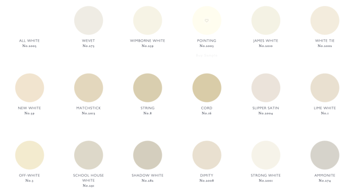
The Diverse Spectrum of Neutral Colors
Neutral colors encompass a broad spectrum of shades and hues. Gray, ranging from light ash to deep charcoal, represents a wide variety of neutral tones. Beige, a mix of white and brown, evokes a warm and natural feel. Brown, often associated with nature, appears in various shades, from light tan to deep mahogany. Black and white represent the extremes of the color spectrum, each with its own distinct symbolic value.
These diverse shades offer a rich palette for creating a variety of moods and aesthetics.
Neutral colors are so versatile, right? They’re great for creating a calming atmosphere, and they work with almost any other color. Speaking of versatility, I recently tried making my own laundry detergent, but the results were less than stellar. My experiment in homemade laundry detergent fail taught me a valuable lesson about trusting the experts (and sticking to store-bought options).
Now, back to neutral colors – they’re definitely my go-to for a reason!
Neutral Colors in Design
Neutral colors, often described as a palette of foundational hues, serve as a versatile backdrop for any design. Their inherent calmness and adaptability allow them to blend seamlessly into various styles, from minimalist to maximalist. They create a flexible foundation upon which other colors and elements can be highlighted, and this versatility makes them crucial in interior design, fashion, and other visual mediums.
Neutral Color Palette in Design
Neutral colors provide a foundation for design, allowing other elements to stand out. Understanding their different shades and tints, as well as how they respond to lighting, is key to creating an impactful space.
| Color | Description | Typical Usage | Emotional Impact |
|---|---|---|---|
| Gray | A versatile neutral, ranging from cool to warm tones. | Architecture, modern interiors, and sophisticated settings. | Tranquility, sophistication, and calmness. |
| Beige | A warm, earthy neutral, often associated with natural elements. | Living rooms, bedrooms, and spaces emphasizing natural aesthetics. | Comfort, warmth, and a sense of grounding. |
| White | A bright, clean neutral that reflects light. | Minimalist and Scandinavian design, creating an airy atmosphere. | Purity, spaciousness, and a sense of openness. |
| Black | A deep, bold neutral that absorbs light. | Modern and contemporary design, adding drama and contrast. | Sophistication, elegance, and a sense of mystery. |
Neutral Colors in Interior Design Styles
Neutral colors are foundational in various interior design styles. Their adaptability allows them to create a diverse range of moods and atmospheres.
| Design Style | Neutral Color Use | Examples |
|---|---|---|
| Minimalist | Emphasizes clean lines and a limited color palette, often using white, gray, and black for walls and furniture. | Simple, uncluttered spaces with carefully chosen furniture pieces. |
| Scandinavian | Utilizes a combination of white, light gray, and light wood tones to create a bright and airy atmosphere. | Open spaces, natural light, and warm wooden accents. |
| Contemporary | Often incorporates a mix of gray, black, and white, creating a sophisticated and modern aesthetic. | Bold use of textures and materials, playing with contrast and depth. |
Shades and Tints in Neutral Ambiance
Varying shades and tints of neutral colors significantly impact the overall ambiance of a space. A lighter shade of gray, for instance, can create a more airy and bright room, whereas a darker shade can evoke a sense of sophistication and drama.
Creating Spaciousness and Coziness with Neutrals
Neutral colors are exceptionally versatile in creating both spacious and cozy environments. By strategically utilizing lighter shades and reflective surfaces, a sense of spaciousness can be achieved. Conversely, layering textures, adding warm lighting, and incorporating rugs and soft furnishings can create a cozy and inviting atmosphere.
Lighting Considerations in Neutral Color Design
Proper lighting is crucial when using neutral colors. Neutral palettes can be easily impacted by the quality and quantity of light. Consider the direction of natural light, and supplement it with strategically placed lamps to avoid a flat or dull appearance. Natural light can amplify the effect of lighter neutrals, while strategically placed lamps can accentuate the depth and texture of darker shades.
Warm lighting can create a cozy ambiance, while cooler lighting can enhance a modern or minimalist aesthetic.
Neutral Colors in Fashion
Neutral colors are fundamental to any fashion wardrobe. They provide a versatile base upon which to build diverse looks, from classic elegance to edgy modern styles. Their adaptability across seasons and occasions makes them indispensable for both everyday wear and high-fashion statements. Understanding how to utilize neutral colors effectively elevates any outfit, offering a sophisticated and timeless appeal.
Common Neutral Colors in Clothing and Accessories
Neutral colors in fashion encompass a spectrum of shades that evoke calmness and balance. These colors are often associated with understated elegance and create a harmonious foundation for any ensemble. Key neutral colors frequently used in clothing and accessories include:
- Beige: A warm, versatile neutral that often evokes a sense of comfort and natural beauty.
- Gray: A sophisticated neutral that can range from light and airy to deep and dramatic, depending on the shade.
- Brown: A rich, earthy neutral that can vary from light tans to deep chocolate tones, adding depth and warmth to outfits.
- Black: A classic neutral that provides a strong and dramatic contrast to other colors.
- White: A pure and bright neutral that offers a clean and fresh appearance.
- Cream: A light, warm neutral that often appears delicate and airy.
Creating Different Looks with Neutrals
Neutral colors can be tailored to produce a variety of looks. The choice of shade, texture, and styling accessories significantly impacts the overall aesthetic.
- Classic: A classic look often relies on muted tones of beige, gray, and brown, paired with simple silhouettes and understated accessories. The overall effect is elegant and timeless.
- Modern: Modern styles incorporate a wider spectrum of neutrals, including charcoal gray and taupe, paired with clean lines and contemporary silhouettes. Accessories like sleek jewelry and structured bags enhance the modern appeal.
- Edgy: Edgy styles can utilize deep grays, black, and brown, often paired with leather, denim, and bold textures. The look is contrasted by the use of sharp accessories, giving a more rebellious edge.
Versatility of Neutrals in Building a Wardrobe
The versatility of neutral colors in fashion lies in their ability to seamlessly blend with a wide array of colors and styles. They serve as a strong foundation for creating diverse and adaptable outfits for various occasions. They are particularly useful for building a capsule wardrobe, as they can be combined with a variety of pieces to create numerous different outfits.
Neutral Color Palettes for Different Seasons
Different seasons call for specific color palettes. Neutrals play a significant role in adapting to these seasonal shifts.
| Season | Neutral Colors |
|---|---|
| Spring | Beige, Cream, Light Gray |
| Summer | Light Gray, White, Taupe |
| Autumn | Brown, Beige, Deep Gray |
| Winter | Black, Gray, Deep Brown |
Creating Cohesive and Stylish Ensembles
Using neutral colors in fashion allows for the creation of cohesive and stylish ensembles. The key is to maintain a balanced and harmonious combination of textures, silhouettes, and accessories. Choosing a dominant neutral color as a base and layering lighter or darker shades can create a sophisticated and cohesive outfit.
Neutrals in High Fashion and Everyday Attire
Neutral colors are just as prominent in high fashion as they are in everyday attire. High-fashion designers often utilize a sophisticated palette of neutrals to create striking and innovative looks, while everyday wear leverages neutrals for comfort and practicality. The use of textures and details further enhances the overall look, whether it’s a high-fashion runway show or a casual day out.
Neutral Colors in Art and Visual Communication
Neutral colors, encompassing shades of white, black, gray, beige, and browns, play a crucial role in art and visual communication. Their versatility allows artists and designers to achieve a wide range of effects, from creating a sense of calm and sophistication to highlighting other colors within a piece. These colors act as a foundation, setting the stage for the emotional and thematic impact of the artwork.Neutral colors offer a powerful tool for creating a balanced and harmonious visual experience.
Their subtle nature allows them to recede into the background, allowing other elements of the composition to stand out. This effect is often used strategically to guide the viewer’s eye and emphasize specific aspects of the artwork.
Neutral colors, like beige and gray, are fantastic for creating a calming atmosphere in any room. They’re a great base for a living room with a fireplace, allowing you to showcase the beautiful hearth and surrounding decor. When considering how to arrange a living room with a fireplace, this guide provides helpful tips on maximizing space and creating a cozy focal point.
Ultimately, neutral colors offer flexibility, making them perfect for a timeless and inviting living space.
Neutral Colors and Mood Evocation
Neutral colors can effectively evoke a variety of moods and themes. Warm neutrals like beige and taupe often evoke feelings of comfort, tranquility, and sophistication. Cool neutrals like gray and slate gray can convey a sense of calmness, elegance, or even mystery. Black and white, the ultimate neutrals, can create a sense of stark contrast, drama, or even a sense of purity and simplicity.
Artists carefully select neutral colors to align with the desired emotional response in their artwork.
Balance and Harmony in Visual Compositions
Neutral colors are masterful tools in creating a sense of balance and harmony within a visual composition. By using neutrals as a backdrop, artists and designers can create a sense of visual equilibrium, allowing other elements to be highlighted without feeling jarring or dissonant. The interplay between neutral tones and more vibrant colors can guide the viewer’s eye and create a focal point.
Neutral colors are a great way to create a calming and versatile space, perfect for any decor style. But what about when those neutral colors get a little…un-neutral? Dealing with a bed bug infestation, especially when it comes to laundry, can turn your once-peaceful space into a real challenge. Luckily, there are effective methods for handle bed bug infestation laundry , so you can get back to enjoying your neutral color scheme.
Ultimately, understanding neutral colors, and how to keep them that way, can make all the difference in maintaining a clean and stylish home.
This strategic use of neutral tones ensures a cohesive and visually pleasing composition.
Examples of Effective Use in Artwork
Numerous artworks throughout history demonstrate the power of neutral colors. Consider the landscapes of the Impressionists, where muted grays and browns create a sense of atmospheric depth and a quiet reverence for nature. The works of artists like Claude Monet and Pierre-Auguste Renoir often use a spectrum of neutral tones to create a soft and harmonious environment, drawing attention to the interplay of light and shadow.
Similarly, many minimalist paintings, using only a range of grays and whites, achieve a profound sense of serenity and contemplation. The consistent use of neutral tones in these artworks contributes significantly to their overall impact and emotional resonance.
Highlighting Other Colors
Neutral colors serve as a powerful tool for highlighting other colors within a piece of art. By contrasting a bold hue with a muted neutral, the artist can emphasize the vibrancy and intensity of the chosen color. The neutral tones create a clear focal point, guiding the viewer’s attention to the specific area or object where the contrasting color is used.
This strategic use of neutral colors allows the artist to effectively communicate the desired message or evoke specific emotions.
Neutral Colors in Graphic Design and Advertising
In graphic design and advertising, neutral colors are frequently employed to create a sophisticated and professional visual identity. Think of the clean and minimalist designs often seen in high-end fashion or technology advertisements. The use of neutral colors in these contexts often suggests quality, reliability, and elegance. A well-chosen palette of neutrals can communicate a specific brand identity or aesthetic.
Creating Visual Identity with Neutral Colors
The use of neutral colors can be instrumental in establishing a specific visual identity for a brand. A consistent application of neutral tones in logos, branding materials, and marketing campaigns can convey a sense of professionalism, sophistication, and trustworthiness. For instance, companies in the financial or luxury sectors often employ a neutral color scheme to project an image of stability and prestige.
This careful selection of neutral colors contributes significantly to the brand’s perceived value and reputation.
Neutral Color Combinations: What Are Neutral Colors

Neutral colors, in their simplicity, offer a powerful canvas for design. They create a sense of calm and balance, allowing other elements to take center stage. Mastering the art of combining neutral colors unlocks a world of versatile and adaptable aesthetics, from serene bedrooms to sophisticated fashion statements. Choosing the right combinations can transform a space or outfit, adding depth and personality.
Neutral Color Combinations Table
Neutral color palettes are highly adaptable and versatile. Choosing the right combination can significantly impact the overall mood and feel of a space or an outfit. The following table illustrates some popular neutral combinations and their associated impressions.
| Primary Neutral | Secondary Neutral | Overall Impression |
|---|---|---|
| Gray | White | Clean, modern, and airy. Evokes a sense of sophistication and tranquility. |
| Beige | Brown | Warm, earthy, and inviting. Creates a cozy and comforting atmosphere. |
| Black | White | Dramatic, sophisticated, and timeless. Exudes elegance and a sense of formality. |
| Gray | Brown | Versatile and grounding. Creates a balanced and sophisticated look, ideal for contemporary settings. |
| Cream | Taupe | Soft, inviting, and elegant. Creates a sense of warmth and sophistication, often used in traditional or classic styles. |
Psychology of Neutral Combinations
The psychology of color is a significant factor when choosing neutral color combinations. For instance, gray and white together create a sense of spaciousness and calmness, making them ideal for bedrooms or minimalist living rooms. The combination of beige and brown evokes a sense of warmth and comfort, perfect for creating a cozy and inviting atmosphere in living rooms or home offices.
Black and white, on the other hand, exudes a sense of sophistication and formality, often used in high-end fashion or corporate settings.
Impact of Neutral Combinations in Different Settings
The impact of neutral color combinations varies greatly depending on the setting. In a home, a gray and white palette might create a modern and spacious feel, while beige and brown might promote a cozy and traditional ambiance. In fashion, black and white is frequently used to create sharp, structured looks, while gray and brown can offer a more casual yet sophisticated approach.
Examples of Neutral Color Palettes
Neutral palettes are incredibly versatile and can be adapted for diverse settings.
- Bedroom: A serene bedroom could use a gray and white palette, complemented with soft textures like linen or wool. Adding pops of color through artwork or accessories can create visual interest without disrupting the overall calm ambiance.
- Living Room: A living room with a beige and brown color scheme can be enhanced with warm lighting and natural elements like wood furniture. Adding a few pops of vibrant green or orange can inject personality without compromising the overall cozy feel.
- Fashion: A neutral outfit using shades of gray and brown can be elevated by incorporating a statement piece, such as a colorful scarf or bold jewelry. Adding textures, like a tweed jacket or a leather bag, can further enhance the overall appeal.
Creating Visually Appealing Neutral Schemes
Creating a visually appealing neutral color scheme often involves considering the following elements:
- Texture: Varying textures can add depth and interest to a neutral palette. Combining smooth surfaces with rough textures, like linen and wood, creates visual appeal.
- Lighting: Strategic use of lighting can significantly impact the mood and appearance of a neutral space. Warm lighting can enhance a cozy atmosphere, while cool lighting can create a modern aesthetic.
- Accents: Adding accents of color, pattern, or texture can elevate a neutral color scheme. A patterned rug, colorful throw pillows, or artwork can bring visual interest without overpowering the overall palette.
Common Mistakes to Avoid
Avoiding a monotonous or dull appearance when using neutral colors requires careful consideration.
- Lack of Variety: Using only one shade of neutral throughout a space or outfit can make it appear flat and uninspired. Incorporating a variety of shades and tones, even within the neutral family, can add visual interest.
- Ignoring Accents: Neutral colors can look bland without any accent colors or textures. Adding pops of color or patterns, even in small doses, can bring life to the palette and prevent it from looking monotonous.
- Overlooking the Importance of Contrast: Neutral colors, while versatile, benefit from contrast. Employing contrasting textures, lighting, or shapes within a neutral palette can elevate the overall appeal.
Final Conclusion
In conclusion, neutral colors are far more than just a palette of basic tones. They represent a powerful language of design, capable of evoking a wide spectrum of emotions and influencing our perception of space, style, and artistry. From subtle shifts in shade to bold contrasts, the versatility of neutral colors is undeniable. We’ve explored their applications across different creative fields, highlighting their ability to create a sense of balance, harmony, and visual interest.
Hopefully, this comprehensive overview has broadened your understanding of the nuanced beauty and practical value of neutral colors.