


Colors that go with gray walls open up a world of design possibilities. Gray walls offer a neutral canvas, allowing you to experiment with a wide range of colors to create any mood you desire, from serene tranquility to vibrant energy. This guide explores a variety of color palettes, considering room function, design styles, and the impact of natural light.
Whether you’re aiming for a cozy Scandinavian vibe or a bold modern aesthetic, we’ll delve into how to choose colors that complement gray walls effectively. We’ll also look at the role of accent colors, the impact of lighting, and how to select the perfect hues for specific rooms like living rooms, kitchens, and bedrooms.
Choosing a Color Palette
Gray walls offer a versatile backdrop for a wide array of interior design styles. Choosing the right color palette is crucial for creating a space that feels harmonious and reflects your personal aesthetic. The key is to select colors that complement the gray, enhance its neutrality, and evoke the desired mood. This guide will explore various color palettes, from calming to energetic, and how to use them effectively with different interior design styles.
Color Palettes for Gray Walls
Gray walls, with their neutral tones, provide a fantastic canvas for showcasing a variety of color palettes. Selecting a palette that aligns with the desired mood and style is essential for creating a visually appealing and comfortable living space. Different color palettes evoke distinct feelings and can transform the ambiance of a room.
- Calming Palettes: These palettes often incorporate soft blues, greens, and lavenders. They create a serene and relaxing atmosphere, ideal for bedrooms and meditation spaces. For example, a combination of pale mint green and soft gray evokes a feeling of tranquility and freshness. Adding touches of warm beige or cream further enhances the sense of calm.
- Energetic Palettes: Vibrant colors like reds, oranges, and yellows can invigorate a space. Pairing these with gray can create a lively and stimulating environment. For example, a combination of deep coral and gray walls can inject a playful energy into a living room or dining area.
- Sophisticated Palettes: These palettes frequently include deep blues, rich grays, and metallics like gold or silver. They project a sense of elegance and sophistication, perfect for formal living rooms or offices. For instance, a combination of charcoal gray walls with deep navy blue accents and brass-toned hardware exudes a refined and stylish ambiance.
Popular Color Combinations
Understanding popular color combinations for different styles is vital for achieving a cohesive and aesthetically pleasing design.
- Scandinavian Style: Light gray walls pair beautifully with white, light wood tones, and soft pastels like blush pink, mint green, or light yellow. This combination evokes a sense of airy lightness and simplicity.
- Modern Style: Dark gray walls can be complemented by bold, contrasting colors like deep navy blue, emerald green, or terracotta. These combinations create a sophisticated and contemporary look. Adding pops of metallic accents enhances the modern aesthetic.
- Bohemian Style: Gray walls provide a neutral backdrop for a diverse range of colors. Consider earthy tones like terracotta, burnt orange, deep greens, and warm browns. Introduce vibrant colors like mustard yellow, teal, or sapphire blue for a bohemian touch.
Color Schemes
Using color schemes effectively can create a visually balanced and harmonious space.
- Complementary Colors: These colors lie opposite each other on the color wheel. Pairing gray with a complementary color like orange or yellow can create a vibrant and striking contrast. For example, a living room with gray walls, orange accents, and yellow furniture can produce a dynamic visual effect.
- Analogous Colors: These colors are adjacent to each other on the color wheel. Using analogous colors like various shades of blue with gray creates a serene and cohesive atmosphere. For example, a bedroom with gray walls, light blue accents, and a teal rug creates a sense of calm and unity.
- Triadic Colors: These colors are evenly spaced around the color wheel. A triadic color scheme, such as using gray, red, and green, can produce a bold and balanced look. For example, a kitchen with gray walls, red cabinetry, and green accents offers a dynamic and visually appealing design.
Color Palette Table
This table provides a quick reference for various color palettes suitable for gray walls.
| Palette Name | Colors | Mood |
|---|---|---|
| Calming Coastal | Gray (#D3D3D3), Light Blue (#ADD8E6), Sage Green (#90EE90) | Relaxing, Tranquil |
| Energetic Sunset | Gray (#969696), Coral (#FF7F50), Mustard Yellow (#FFDB58) | Lively, Playful |
| Sophisticated Modern | Gray (#708090), Deep Teal (#008080), Metallic Gold (#FFD700) | Elegant, Refined |
| Scandinavian Simplicity | Gray (#D3D3D3), White (#FFFFFF), Light Beige (#F5F5DC) | Airy, Simple |
| Bohemian Earthy | Gray (#A9A9A9), Terracotta (#EFC08F), Burnt Orange (#E08F4E) | Warm, Inviting |
Considering the Room’s Function
Choosing the right colors for your space is more than just aesthetics; it’s about creating an environment that perfectly complements its function. A thoughtfully selected color palette can dramatically impact the mood and atmosphere of a room, making it feel inviting, productive, or relaxing, depending on the intended use. This section dives into how the purpose of a room influences color choices, exploring how colors affect the atmosphere, and how to enhance natural light with gray walls.Understanding the room’s purpose is crucial in selecting a color scheme.
A vibrant dining room might benefit from warm, inviting hues, while a tranquil bedroom could use calming, softer tones. The function of a space directly influences the overall feel and atmosphere you want to create. A bedroom designed for relaxation will differ significantly from a home office built for productivity.
Influence of Room Function on Color Choices
Different room functions respond to different color palettes. A dining room, for instance, often benefits from warm, inviting colors that stimulate appetite and promote social interaction. Cool, calming colors might be more appropriate for a bedroom or a bathroom. The specific shade of color used will affect the room’s atmosphere in addition to the function.
Impact of Colors on Mood and Atmosphere
Colors have a profound effect on our emotions and perceptions. Warm colors like reds, oranges, and yellows evoke feelings of warmth, energy, and excitement. Cool colors like blues, greens, and purples create a sense of calm, serenity, and tranquility. These emotional responses can be harnessed to design spaces that support specific activities.
Examples of Colors for Specific Moods
- Relaxation: Soft blues, calming greens, and muted lavenders are excellent choices for bedrooms and relaxation areas. These colors promote a sense of peace and tranquility, encouraging rest and rejuvenation. The use of natural light is crucial to avoid making the space feel overly dark or gloomy.
- Productivity: Cool blues, deep greens, and grays are conducive to focus and concentration. These colors create a calm yet stimulating environment, ideal for home offices or study areas. Incorporating pops of brighter colors can add visual interest without distracting from the focus.
- Social Interaction: Warm yellows, oranges, and reds can create a lively and energetic atmosphere, perfect for dining rooms, living rooms, or social spaces. These colors encourage conversation and interaction, making the room feel welcoming and stimulating.
Enhancing Natural Light with Gray Walls
Gray walls, while neutral, can be a fantastic base for creating a space that feels bright and airy. To maximize natural light, consider the following:
- Light-Reflective Colors: Pair gray walls with lighter, reflective colors for furniture and accessories. This will bounce light around the room, making it feel brighter and more spacious. Avoid dark, absorbing colors, which can diminish the impact of natural light.
- Strategic Placement of Mirrors: Strategically placed mirrors can reflect light and create the illusion of more space. Mirrors placed opposite windows or in areas with limited natural light can dramatically enhance the room’s brightness.
- Window Treatments: Select sheer or light-colored curtains that allow natural light to filter through the windows. Avoid heavy, dark curtains, which can absorb light and make the room feel smaller and darker.
Exploring Different Design Styles
Gray walls offer a fantastic neutral backdrop, allowing you to infuse a room with personality through carefully chosen color palettes and design elements. They provide a blank canvas for expressing diverse aesthetics, from the cozy warmth of rustic charm to the sleek sophistication of contemporary design. Understanding how different color combinations interact with gray can transform a space from ordinary to extraordinary.The key to creating a successful color scheme with gray walls is to understand the relationship between colors and the overall design style you want to achieve.
This involves considering not only the hues themselves but also the intensity and saturation of the colors, as well as how they interact with the room’s lighting and architectural features. By thoughtfully selecting colors, you can effectively accentuate or downplay certain aspects of the room’s layout, making the most of the space.
Color Combinations for Different Design Styles
Different design styles lend themselves to specific color palettes. Understanding these preferences helps create a cohesive and visually appealing space. For example, a rustic style often embraces earthy tones, while a minimalist style prioritizes clean lines and neutral colors. A vintage style might feature softer, more muted tones inspired by past eras.
| Style | Color Palette | Description |
|---|---|---|
| Rustic | Warm browns, terracotta, deep greens, creams | Earthy tones evoke a sense of warmth and comfort, perfect for creating a cozy and inviting atmosphere. |
| Minimalist | Shades of gray, white, black, subtle pops of accent color | Clean lines and neutral colors create a sense of calm and spaciousness, allowing the architectural elements to take center stage. |
| Vintage | Muted pastels, soft blues, greens, and pinks, jewel tones | Evoking a sense of nostalgia, these colors are perfect for adding a touch of charm and character. |
| Contemporary | Deep blues, rich greens, mustard yellow, charcoal gray, and metallic accents | These colors are bold yet sophisticated, enhancing the modern feel of the room while maintaining elegance. |
Complementing Gray Walls in Contemporary Homes
Contemporary design often embraces a clean, minimalist aesthetic, which pairs beautifully with gray walls. Deep blues, rich greens, and even bold mustard yellows can be used as accents to create a striking focal point. Consider incorporating metallic accents, such as brass or copper, to further enhance the modern feel.
Highlighting Architectural Features
Using color strategically can highlight architectural features in a room with gray walls. For instance, painting a fireplace surround a rich, contrasting color can draw attention to this focal point. Likewise, a bold color can be used to accentuate a vaulted ceiling or other unique architectural details.
Accentuating and Downplaying Aspects of Room Layout
Color can be used to either accentuate or downplay different aspects of a room’s layout. For example, painting a small, cramped room in a light, airy color can make it appear larger. Conversely, a bold color can be used to define a specific area, such as a dining area or a reading nook. The use of color can affect the perceived size and focal points of a room.
Accent Colors and Their Impact
Adding accent colors to a room with gray walls is a powerful way to personalize the space and create a captivating atmosphere. Gray, while neutral and versatile, can sometimes feel a bit understated. Accent colors inject personality and visual interest, transforming a room from merely functional to truly engaging. The strategic use of accent colors can define a space, evoke emotions, and create focal points that draw the eye and enhance the overall aesthetic.Accent colors act as a dynamic element in a room with gray walls.
Gray walls are surprisingly versatile! They’re a great neutral base, and choosing the right accent colors can make a room pop. Thinking about updating your home? The old house new issue the old house new issue might have some helpful tips for similar projects. Warm earthy tones like terracotta or burnt orange work beautifully, or for a more modern vibe, consider deep blues or rich greens.
Ultimately, the best colors for gray walls depend on your personal style and the overall feel you’re aiming for.
They provide a striking contrast to the neutral base, allowing for a play of light and shadow, and making the space feel more lively and less monotonous. They can add vibrancy and visual appeal, transforming a space that might otherwise appear plain. The right accent colors can bring a room to life and make it feel truly unique.
Choosing Accent Colors to Complement Gray Walls
Gray walls offer a fantastic backdrop for a wide array of accent colors. The key is to select colors that complement, not clash with, the gray. Colors that contrast beautifully with gray often include jewel tones, bold primary colors, or soft pastels, depending on the desired mood and style.
Using Accent Colors to Create Focal Points
Accent colors can be strategically placed to create focal points in a room. A colorful piece of furniture, a patterned rug, or a collection of artwork in a complementary hue can instantly draw the eye and make the area stand out. This technique is effective for emphasizing architectural features, showcasing artwork, or creating a cozy reading nook.
Bold Accent Colors vs. Subtle Ones, Colors that go with gray walls
Bold accent colors, such as crimson, emerald green, or sapphire blue, create a dramatic and vibrant impact. They are perfect for rooms where you want to make a bold statement. Subtle accent colors, like muted lavenders, dusty rose, or warm beiges, offer a more calming and sophisticated feel. The choice depends entirely on the overall aesthetic and desired atmosphere of the room.
Choosing Accent Colors that Complement the Gray Walls
A harmonious color palette is essential. Colors that complement gray often share undertones with gray itself, such as blues, greens, and purples. Warm grays work well with terracotta, burnt orange, and golds, while cool grays pair beautifully with soft blues, teals, and lavender. A color wheel can be a valuable tool for identifying complementary color schemes.
Striking Accent Colors Against Gray Walls
A list of accent colors that stand out beautifully against gray walls includes:
- Emerald green:
- Crimson red:
- Sapphire blue:
- Mustard yellow:
- Turquoise:
A rich, deep green with a cool undertone, creates a sophisticated and tranquil atmosphere.
A bold and powerful red that adds energy and vibrancy.
A deep, rich blue with a cool undertone, evoking a sense of serenity and luxury.
A warm, golden yellow that adds a touch of warmth and cheerfulness.
A vibrant blue-green that creates a sense of freshness and vitality.
These colors, with their inherent visual appeal, create a compelling contrast against the neutral gray. They add a pop of personality and excitement to the room, making it more inviting and aesthetically pleasing.
Coordinating Accent Colors with Existing Furniture and Accessories
When choosing accent colors, consider the existing furniture and accessories in the room. Select accent colors that harmonize with existing pieces to create a cohesive and visually appealing space. If the room already has a dominant color, use accent colors that complement it. For example, if the room has a lot of brown furniture, use accent colors that complement brown, such as gold, beige, or terracotta.
If the room has a lot of white or cream, use more vibrant or bold accent colors to create contrast and interest.
Impact of Natural Light and Wall Finishes

Choosing the perfect color palette for a room is a multifaceted process, and understanding how natural light and wall finishes interact with colors is crucial. The interplay between light, finish, and hue significantly affects the final aesthetic and atmosphere of a space. This section delves into the subtle yet powerful impact these factors have on your color choices.The way light interacts with color is complex.
Natural light, whether abundant or limited, casts different shades and highlights, which can alter the perceived intensity and vibrancy of a chosen color. Wall finishes, from matte to glossy, also play a role in reflecting and diffusing light, influencing how colors appear to the eye.
Influence of Natural Light on Color Perception
Natural light significantly impacts how colors appear in a room with gray walls. Direct sunlight can wash out colors, making them appear lighter and less saturated. Conversely, diffused light, often found in rooms with large windows or abundant natural light sources, allows colors to stand out more vividly. Rooms with limited natural light, such as those with smaller windows or those facing north, can make colors appear muted or less intense.
Gray walls are surprisingly versatile! When choosing colors to complement them, think about warm tones like burnt orange or deep reds, or cool tones like blues and greens. But before you get painting, remember that rubbing alcohol, while a handy cleaning solution for some surfaces, is definitely not a universal cleaning hero. In fact, it’s one of the things you should never clean with rubbing alcohol according to this helpful guide: things you should never clean with rubbing alcohol.
Ultimately, a well-chosen color palette can really make a room pop against a gray backdrop. So, let your creativity shine when choosing the perfect colors to complement your gray walls!
Understanding the amount and type of natural light in a room is therefore critical in selecting colors that will look their best.
Effect of Wall Finishes on Color Perception
Different wall finishes have distinct effects on how colors are perceived. Matte finishes tend to absorb light, making colors appear more subdued and slightly muted. Satin finishes reflect light more evenly, creating a slightly smoother appearance and slightly more vibrant color. Glossy finishes, on the other hand, reflect light intensely, amplifying the perceived vibrancy of colors, making them appear more saturated.
Colors for Rooms with Varying Light Conditions
Rooms with abundant natural light allow for a wider range of color choices. For example, jewel tones like emerald green, sapphire blue, or ruby red can stand out beautifully. A bolder accent wall in a vibrant color can create a focal point. In rooms with low light, it’s best to opt for colors that create a sense of spaciousness and warmth.
Gray walls are surprisingly versatile! For a pop of vibrancy, consider warm tones like terracotta or sunny yellows. To complement gray, you could also plant some fast growing flower seeds, like zinnias or sunflowers, fast growing flower seeds that quickly add color to your space. Ultimately, the key is finding colors that truly resonate with you and create a space you love.
Pastels, softer neutrals, and warm, earth tones like terracotta or beige can enhance the feeling of openness.
Color Selection Based on Gray Wall Tone
The shade of gray in the walls also influences the best color choices. Light gray walls provide a neutral canvas, allowing a broader spectrum of colors to work well. From soft blues and greens to bolder oranges and yellows, light gray walls can accommodate a wide array of choices. Dark gray walls, conversely, work best with colors that have more depth and intensity.
Deep blues, rich greens, and even warm reds can complement the depth of dark gray.
Creating Perceptions of Space with Color
Colors can be strategically used to make a room feel larger or smaller. Light and airy colors like pastels or light neutrals tend to create an illusion of more space. In contrast, darker colors can make a room feel more intimate. However, using dark colors strategically, such as in a well-defined seating area or a focal point, can enhance the perceived depth of the room.
A well-placed dark accent wall, for example, can make a small room feel more inviting without overwhelming the space.
Color Combinations for Specific Rooms: Colors That Go With Gray Walls
Choosing the right color palette for each room is crucial for creating a space that feels inviting and functional. Beyond aesthetics, colors can influence mood, stimulate creativity, or promote relaxation, all depending on the room’s intended use. Understanding the principles behind specific color combinations allows you to tailor the atmosphere to the room’s purpose.Color combinations can significantly impact a room’s overall ambiance.
Warm colors like reds and oranges tend to evoke feelings of energy and excitement, while cooler colors like blues and greens promote tranquility and calmness. The interplay between these color families creates a spectrum of possibilities, allowing you to craft a space that is both visually appealing and emotionally resonant.
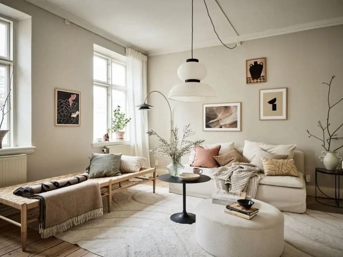
Living Room Color Palettes
A well-designed living room often serves as the heart of the home. Color choices in this space should reflect the room’s function as a gathering place and a place for relaxation.
- A warm, inviting atmosphere is achieved through combinations of warm neutrals, such as creams, beige, and light browns, accented with pops of deeper, rich colors like emerald green or burnt orange. This palette creates a welcoming and comfortable space for family and friends.
- For a modern, sleek aesthetic, a combination of cool grays, soft blues, and white can create a calming and airy feel. Adding pops of vibrant colors like sunny yellow or coral can add a touch of energy without overwhelming the room.
- A sophisticated and timeless look can be achieved with a combination of deep navy blue or charcoal gray walls, complemented by lighter neutrals like cream or beige. Adding pops of gold or brass accents can elevate the space and create a sense of luxury.
Kitchen Color Palettes
Kitchens are often hubs of activity, demanding color palettes that are both aesthetically pleasing and functional.
- A bright and airy kitchen can be created using a combination of white or light gray walls with pops of vibrant colors, such as sunny yellow or deep teal. This palette helps to make the space feel spacious and energetic.
- For a more traditional feel, consider a combination of warm neutrals, such as creamy off-white or light beige, with accents of warm colors like terracotta or mustard yellow. These colors can create a cozy and inviting atmosphere, ideal for family meals.
- A contemporary kitchen can be achieved with cool neutrals like gray or charcoal, contrasted with vibrant colors like deep emerald green or deep sapphire blue. This combination balances functionality with a stylish aesthetic.
Bathroom Color Palettes
Bathrooms are spaces designed for relaxation and rejuvenation. Color choices should reflect this intended function.
- A calming and serene atmosphere is created by using soft blues, greens, or lavenders. These colors are associated with feelings of peace and tranquility, promoting a relaxing experience in the bathroom.
- A contemporary feel can be achieved by combining light gray or white walls with pops of deep blues or greens. This combination offers a balance between elegance and practicality.
- For a bold and luxurious feel, consider using deep jewel tones like emerald green or sapphire blue, combined with neutral accents. This creates a visually striking space that is both stylish and relaxing.
Kids’ Room Color Palettes
Kids’ rooms should be vibrant and stimulating, reflecting the energy and creativity of children.
- A cheerful and playful atmosphere can be achieved with a combination of bright, bold colors like sunny yellow, vibrant orange, or deep teal. These colors can stimulate creativity and encourage imagination.
- For a more calming and inspiring space, consider a combination of soft pastels like lavender, mint green, or light blue, accented with pops of brighter colors. This combination encourages a sense of peace and tranquility, promoting a good night’s sleep.
- A fun and inviting atmosphere is achieved with a combination of warm colors like coral, peach, or golden yellow, balanced with cool colors like mint green or sky blue. This combination creates a space that is both vibrant and soothing, encouraging creativity and imagination.
Suggested Color Palettes
| Room | Color Palette | Description |
|---|---|---|
| Living Room | Cream/Beige/Taupe + Emerald Green/Burnt Orange | Inviting and warm |
| Kitchen | White/Light Gray + Sunny Yellow/Deep Teal | Bright and airy |
| Bathroom | Soft Blue/Green/Lavender | Calming and serene |
| Kids’ Room | Bright Yellow/Orange/Teal | Playful and stimulating |
Visual Inspiration and Examples
Gray walls offer a fantastic neutral backdrop, allowing you to experiment with a wide array of colors and create various moods and styles. Understanding how different color combinations interact with gray can dramatically transform a space. This section explores inspiring examples and demonstrates the power of color psychology in interior design.Color psychology plays a significant role in interior design.
Different colors evoke different emotions and associations. Understanding these psychological effects allows you to create a space that feels precisely as you intend. Applying this knowledge to your gray-walled rooms can elevate your space from functional to truly inspiring.
Color Palette Inspiration for Gray Walls
Gray walls, with their versatility, can be paired with a multitude of color palettes. Choosing the right colors can transform a room from plain to personalized. The following examples illustrate various design approaches.
- Warm Neutrals and Earthy Tones: This palette utilizes shades of beige, taupe, and terracotta to create a cozy and inviting atmosphere. Imagine a living room with gray walls, accented by warm beige sofas and a terracotta-colored area rug. The muted tones create a sense of calm and tranquility, perfect for relaxing evenings at home. This palette is particularly effective in rooms with limited natural light, as the warm colors reflect and amplify the available light.
- Cool Tones and Soft Pastels: Pairing gray walls with soft pastels like lavender, mint green, or light blue creates a serene and calming environment. This palette is ideal for bedrooms or bathrooms. Imagine a bedroom with gray walls, a mint green headboard, and light blue throw pillows. The soft hues create a calming and relaxing atmosphere, perfect for unwinding after a long day.
- Bold Accents and Dramatic Colors: For a bolder statement, consider using deep jewel tones like emerald green, sapphire blue, or ruby red as accents. These vibrant colors add a dramatic touch to a room with gray walls. A dining room with gray walls, accented by a deep emerald green dining table and chairs, creates a sophisticated and inviting atmosphere. The bold colors provide a focal point and draw the eye while maintaining a neutral base.
Examples of Interior Design Inspiration
Numerous interior design styles can be achieved with gray walls. The following examples showcase diverse interpretations.
“The key to successful color coordination is to understand how different colors interact with one another and how they impact the overall mood and atmosphere of a space.”
- Modern Minimalist: A modern minimalist living room with gray walls, white furniture, and pops of black accents creates a clean and sophisticated atmosphere. This style is characterized by its simplicity and focus on functionality. A neutral color palette with carefully chosen accents allows the architectural elements of the room to take center stage.
- Rustic Farmhouse: Gray walls can also complement a rustic farmhouse aesthetic. Pairing gray walls with natural wood tones, warm whites, and touches of terracotta or cream creates a cozy and inviting atmosphere. Imagine a kitchen with gray walls, a light-wood countertop, and accents of terracotta pottery. This combination brings a sense of warmth and nature into the room.
- Coastal Elegance: Gray walls, combined with soft blues, creams, and whites, can evoke a coastal aesthetic. This palette is ideal for bedrooms or living rooms. Imagine a bedroom with gray walls, light blue bedding, and white wooden furniture. The combination creates a serene and calming atmosphere that evokes the feeling of a beach house.
Color Psychology in Room Design
Color psychology is the study of how colors affect human behavior and emotions. Understanding these effects can help you create spaces that meet specific needs and preferences.
| Color | Psychological Effect | Room Application |
|---|---|---|
| Red | Stimulating, passionate, energetic | Dining room, kitchen (to encourage appetite) |
| Blue | Calming, peaceful, trustworthy | Bedrooms, bathrooms, living rooms (to promote relaxation) |
| Green | Refreshing, growth, balance | Bedrooms, living rooms, gardens (to create a sense of harmony) |
Applying color psychology to room design can create a space that enhances well-being and productivity. This table provides a brief overview of the effects and appropriate room applications.
Final Wrap-Up
Ultimately, choosing the right colors with gray walls is a personal journey of exploration and expression. By considering the mood you want to evoke, the function of the room, and the design style you envision, you can transform your space into a beautiful and harmonious reflection of your unique taste. Experiment, have fun, and most importantly, create a space you love!