


Colors that go with emerald green are a vibrant and versatile palette, opening up a world of possibilities for any design project. From calming interiors to eye-catching fashion statements, understanding the nuances of emerald green’s undertones and complementary colors is key to achieving the perfect aesthetic. This exploration delves into various color schemes, from complementary to triadic, providing a comprehensive guide to pairing emerald green effectively.
This guide explores different shades of emerald green, their undertones, and how these nuances affect color pairings. We’ll analyze complementary, analogous, and triadic color schemes, providing practical examples for interior design, fashion, and more. Discover the psychological impact of emerald green and how its emotional associations influence color choices. Finally, we’ll discuss how to create cohesive color palettes using these principles.
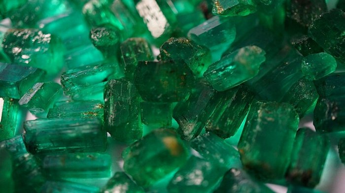
Emerald Green’s Undertones and Hues
Emerald green, a captivating jewel tone, often evokes feelings of nature, luxury, and freshness. Understanding its undertones and shades unlocks a deeper appreciation for its versatility in design and fashion. This exploration delves into the nuances of emerald green, revealing how its variations impact color pairings.Emerald green, like other colors, can exhibit warm, cool, or neutral undertones. These subtle variations affect how the color interacts with its surroundings, influencing the overall aesthetic.
By identifying the undertones, designers and individuals can create harmonious and visually appealing color palettes.
Emerald Green Undertones
Emerald green’s undertones are a critical consideration when selecting complementary colors. A cool-toned emerald green will harmonize with colors like blues, purples, and even greys. Conversely, a warm-toned emerald green might work well with oranges, yellows, and golds. Neutral undertones bridge the gap, allowing for a broader range of pairings. This adaptability makes emerald green a versatile choice in various design applications.
Shades and Tints of Emerald Green
Emerald green encompasses a spectrum of shades and tints. A shade is a darker version of the base color, while a tint is a lighter version. Understanding these variations allows for a tailored approach to color coordination. Darker shades of emerald green can add depth and drama, while lighter tints can create a more delicate and airy ambiance.
Color Pairings for Emerald Green Shades
The following table provides a concise overview of different emerald green shades and their suggested complementary colors.
| Shade Name | Hex Code | Complementary Color | Description |
|---|---|---|---|
| Deep Emerald | #006400 | Peach | A rich, deep shade of emerald green. The complementary peach color creates a vibrant contrast, suitable for bold and luxurious designs. |
| Forest Green | #228B22 | Lavender | A slightly muted, earthy shade of emerald green. The delicate lavender complements the forest green’s grounded tone, creating a tranquil and sophisticated feel. |
| Emerald | #50C878 | Scarlet | A classic emerald green, a perfect balance between deep and light. Scarlet, a bold red-orange, provides a striking contrast that elevates the elegance of the color scheme. |
| Jade | #00FA9A | Burgundy | A vibrant, light emerald green, akin to jade. The rich burgundy creates a sophisticated contrast, ideal for modern and elegant design schemes. |
Complementary Colors for Emerald Green
Emerald green, with its rich vibrancy and cool undertones, pairs beautifully with a variety of complementary colors. Understanding complementary color schemes is key to creating harmonious and visually appealing color palettes. These pairings can dramatically impact the mood and feeling evoked by a design, whether it’s a home interior, a fashion ensemble, or a piece of artwork.Complementary colors are colors that sit opposite each other on the color wheel.
This opposition creates a strong visual contrast, making both colors stand out and enhancing the overall aesthetic appeal. The high contrast between complementary colors often results in a vibrant and energetic effect. Applying this concept to emerald green reveals a spectrum of possibilities.
Emerald Green and Its Complementary Colors, Colors that go with emerald green
Complementary colors offer a dynamic contrast that can elevate the visual impact of emerald green. The contrast between the two colors creates a striking visual effect, making both colors stand out and enhance the overall design. This contrast is particularly effective in drawing attention to specific elements or creating a focal point.
Complementary Color Palettes
The following table illustrates several complementary color palettes featuring emerald green. These examples demonstrate how the contrast of complementary colors can be used to create diverse moods and applications.
| Emerald Green Shade | Complementary Color | Mood/Feeling | Use Cases |
|---|---|---|---|
| Deep Emerald Green | Coral Orange | Energetic, vibrant, and bold | Fashion accessories, interior design accents, or artwork featuring strong visual statements |
| Medium Emerald Green | Peachy Orange | Warm, inviting, and cheerful | Interior design for living rooms, bedrooms, or spaces that need a comforting atmosphere |
| Light Emerald Green | Golden Yellow | Optimistic, bright, and lively | Children’s rooms, party decorations, or spaces that need a joyful and energizing ambiance |
| Muted Emerald Green | Dusty Rose | Sophisticated, romantic, and calming | High-end fashion, sophisticated interiors, or artistic pieces emphasizing elegance |
| Emerald Green with Blue Undertones | Warm Orange-Red | Exuberant, dynamic, and playful | Product packaging, fashion designs, or designs aiming for a high-energy feel |
Analogous Color Schemes with Emerald Green

Emerald green, with its rich vibrancy and cool undertones, pairs beautifully with a range of analogous colors. Understanding analogous color schemes allows designers and artists to create harmonious and visually appealing compositions. These schemes are particularly useful for creating a sense of tranquility and unity in a design.Analogous color schemes utilize colors that are adjacent to each other on the color wheel.
This proximity ensures a smooth transition between hues, resulting in a cohesive and balanced aesthetic. The use of analogous colors often evokes a sense of calm and harmony, making them well-suited for a variety of applications, from interior design to fashion and graphic design.
Emerald Green Analogous Color Palettes
Analogous color schemes leverage the natural relationship between colors that are next to each other on the color wheel. This proximity creates a sense of harmony and flow. The resulting color combinations often feel cohesive and visually pleasing.
| Emerald Green Shade | Analogous Colors | Overall Impression | Suitable Environments |
|---|---|---|---|
| Deep Emerald Green (#006400) | Forest Green (#228B22), Olive Green (#808000), Yellow-Green (#9ACD32) | Earthy, serene, and natural. | Nature-inspired settings, gardens, forests, or spaces promoting relaxation. |
| Emerald Green with Blue Undertones (#008080) | Teal (#008080), Turquoise (#40E0D0), Sky Blue (#87CEEB) | Cool, refreshing, and calming. | Coastal settings, bedrooms, bathrooms, or spaces needing a sense of tranquility. |
| Light Emerald Green (#90EE90) | Lime Green (#32CD32), Yellow-Green (#9ACD32), Pale Yellow (#FFFFE0) | Fresh, vibrant, and uplifting. | Playful spaces, children’s rooms, kitchens, or environments needing a boost of energy. |
| Muted Emerald Green (#50C878) | Seafoam Green (#32CD32), Mint Green (#98FB98), Light Sage (#BDB76B) | Subtle, sophisticated, and elegant. | Modern living spaces, offices, or settings that demand a sophisticated and polished aesthetic. |
How Analogous Colors Create Harmony
The harmonious effect of analogous colors stems from their shared color family. This shared base creates a smooth transition between colors, avoiding jarring contrasts and harsh transitions. The subtle variations in hue and saturation within an analogous scheme lead to a visually appealing and balanced composition. This creates a sense of unity and cohesiveness.
Triadic Color Schemes with Emerald Green
Triadic color schemes offer a vibrant and balanced approach to design, especially when incorporating a captivating hue like emerald green. These schemes utilize three colors equidistant on the color wheel, creating a dynamic and visually appealing combination. Understanding how these colors interact with emerald green unlocks exciting design possibilities, from fashion to interior design.Triadic color schemes, by their very nature, create a lively and energetic aesthetic.
The juxtaposition of the three colors, while maintaining a harmonious relationship, ensures visual interest and prevents monotony. Pairing these triadic colors with the rich depth of emerald green allows designers to create a sophisticated yet playful effect, making them a valuable tool for achieving a variety of design goals.
Understanding Triadic Color Schemes
Triadic color schemes derive from the fundamental structure of the color wheel. These schemes select three colors that are equally spaced around the color wheel. This arrangement often results in a visually balanced and stimulating palette, perfect for creating striking designs. The use of triadic colors creates a dynamic contrast that can be both harmonious and eye-catching.
Emerald Green and its Triadic Companions
The vibrant nature of emerald green lends itself beautifully to triadic color schemes. The rich green hue can be balanced and complemented by colors that offer contrasting yet harmonious visual effects. This results in palettes that are both engaging and aesthetically pleasing. The key is choosing the right triadic partners for the specific shade of emerald green used.
Examples of Triadic Palettes with Emerald Green
A well-chosen triadic color scheme, when paired with emerald green, can evoke a range of emotions and create diverse visual experiences. The vibrant nature of emerald green works particularly well with colors that contrast its green tones but also share a similar level of vibrancy.
| Emerald Green Shade | Triadic Colors | Visual Effect | Design Ideas |
|---|---|---|---|
| Deep Emerald Green | Orange-Red, Violet | Bold, dramatic, and energetic. | Fashion: statement pieces, vibrant interiors, and bold graphic designs. |
| Muted Emerald Green | Yellow-Orange, Blue-Violet | Subtle, sophisticated, and calming. | Interior design: bedrooms, living rooms, and modern spaces, adding depth and interest. |
| Bright Emerald Green | Red-Orange, Blue | Playful, lively, and attention-grabbing. | Graphic design: posters, brochures, and branding materials that need to stand out. |
| Emerald Green with a hint of blue | Yellow-Orange, Red-Violet | Sophisticated, engaging, and eye-catching. | Product packaging: cosmetics, high-end items, or other products that need to feel premium. |
Accent Colors for Emerald Green
Emerald green, with its rich depth and vibrant hue, demands a thoughtful approach to accent colors. These complementary shades play a crucial role in highlighting the emerald green’s unique character and creating a visually appealing and balanced design. A well-chosen accent color can either enhance the emerald green’s beauty or diminish its impact, making the selection process essential for a successful design outcome.
The Role of Accent Colors
Accent colors act as a focal point in a design, drawing attention to specific elements and enhancing the overall aesthetic appeal. When used effectively, accent colors can create visual interest, highlight patterns, or add a touch of personality to an emerald green-based design. They can also serve as a bridge between different elements, creating a harmonious flow within the design.
Selecting Accent Colors for Emerald Green
The selection of accent colors depends on the specific shade of emerald green being used and the desired overall aesthetic. Consider the undertones of the emerald green – whether it leans towards blue, gray, or yellow – when choosing accent colors. A color that complements the undertones will create a harmonious and balanced look.
Examples of Accent Colors
Emerald green pairs beautifully with a variety of accent colors. These colors can range from warm and inviting to cool and sophisticated, depending on the desired effect. Some excellent choices include gold, bronze, deep reds, navy blue, and deep orange. Neutral colors like cream, beige, and taupe can also provide a calming contrast and enhance the sophistication of an emerald green design.
Emerald green is stunning, but what colors complement it best? Think deep golds and warm browns, and for a truly striking contrast, try some dusty rose or even bright orange. Knowing how to remove mud stains from your clothes is also a valuable skill, especially if you’re a fan of emerald green clothing. If you want to learn the best methods for getting mud out, check out this helpful guide on how to remove mud stains.
Ultimately, the key to pulling off emerald green is choosing colors that either pop against it or create a sophisticated, harmonious look.
Accent Color Palette Table
| Emerald Green Shade | Accent Color | Visual Effect | Suitable Applications |
|---|---|---|---|
| Emerald Green (Deep, rich tone) | Gold | Creates a luxurious and opulent feel; enhances the richness of the green. | High-end fashion, jewelry, luxury home decor. |
| Emerald Green (Slightly muted) | Deep Red | Creates a dramatic and bold contrast; adds a touch of intensity. | Fashion, graphic design, interior design for dramatic rooms. |
| Emerald Green (Blue-toned) | Navy Blue | Creates a sophisticated and elegant contrast; emphasizes the coolness of the green. | Formal events, corporate branding, luxury interiors. |
| Emerald Green (Yellow-toned) | Bronze | Creates a warm and inviting feel; complements the richness of the green. | Restaurant decor, home interiors with a cozy atmosphere. |
| Emerald Green (Muted, Gray-toned) | Cream | Creates a calming and serene effect; emphasizes the elegance of the green. | Spa interiors, high-end boutiques, relaxation spaces. |
Color Psychology and Emerald Green

Emerald green, with its rich, vibrant hue, evokes a complex range of emotions and associations. Understanding its psychological impact is crucial when pairing it with other colors, as the interplay between these hues can significantly alter the overall feeling conveyed. This exploration delves into the emotional resonance of emerald green and how its associations influence color palettes.Emerald green, often associated with nature, prosperity, and growth, possesses a unique ability to evoke a sense of calm and vitality.
Its deep, lush tones invite introspection and contemplation, while its vibrant undertones inspire optimism and confidence. This inherent emotional quality plays a pivotal role in shaping the overall effect of any color combination involving emerald green.
Emotional Impact of Emerald Green
Emerald green, with its grounding and soothing qualities, often evokes feelings of tranquility and harmony. Its rich tones can foster a sense of serenity and peacefulness, making it a popular choice for environments seeking to promote relaxation and well-being. Conversely, its vibrancy can also inspire feelings of energy and excitement, particularly when paired with complementary colors.
How Emotional Associations Affect Color Pairings
The emotional associations of emerald green influence how other colors are perceived in combination. For example, pairing emerald green with warm, earthy tones like terracotta or burnt orange can create a sense of grounded prosperity and abundance. Conversely, pairing it with cool, crisp blues can evoke a sense of calmness and sophistication. The subtle shifts in emotional impact depend largely on the specific hues and intensities used in the combination.
Emerald green is a stunning color, but knowing what complements it can be tricky. Think deep blues and golds for a rich, sophisticated look. Learning how to keep your coffee maker sparkling clean is also important, like the Cuisinart, which you can find detailed instructions for here. Ultimately, the best pairings for emerald green depend on the specific shade and the overall aesthetic you’re aiming for, but these jewel tones are always a great starting point.
Examples of Color Pairings and Their Emotional Effects
The emotional impact of emerald green pairings is evident in various applications. A bedroom decorated in emerald green and soft lavender evokes a calming and serene atmosphere, ideal for promoting relaxation and restful sleep. Conversely, an office space incorporating emerald green with bold, assertive oranges can create a vibrant and energetic environment, stimulating creativity and productivity. The specific emotional response depends on the intensity and balance of the color scheme.
Emerald green is stunning, but sometimes a room needs a little extra pep. Pairing it with the right colors can make all the difference, and choosing the right paint color to brighten dark rooms can really elevate the space. For example, consider warm neutrals like beige or cream, or even a touch of gold. Exploring paint color options like these can dramatically change the mood and feel of a space, especially if you’re looking to open up a dark room.
Ultimately, choosing colors that go with emerald green is all about creating a harmonious and inviting atmosphere. paint color to brighten dark rooms will give you more ideas on how to best achieve that.
Emerald Green and Specific Moods/Feelings
Emerald green is strongly associated with feelings of harmony and balance. Its inherent qualities often connect with positive emotions like hope, optimism, and growth. This is further amplified by the cultural and historical associations of green with nature and prosperity. Emerald green, therefore, can play a significant role in setting a positive and uplifting mood, particularly when incorporated into environments where relaxation, inspiration, or rejuvenation is desired.
Emerald Green in Different Settings
Emerald green, with its vibrant hue and rich undertones, is a versatile color that can transform various settings. Its captivating nature makes it a powerful choice for interior design, fashion, and beyond. Understanding how to pair emerald green effectively with other colors is key to achieving the desired mood and aesthetic in different contexts.Emerald green’s ability to evoke a range of emotions, from sophistication to freshness, makes its application dependent on the specific setting.
A subtle shade of emerald in a bedroom might promote tranquility, while a bolder tone in a restaurant could enhance the vibrancy of the atmosphere. The best color combinations for emerald green vary significantly based on the context, whether it’s a formal event, a casual gathering, or a home decor project. This exploration delves into the nuances of emerald green usage across different environments.
Emerald Green in Interior Design
Emerald green, when incorporated into interior design, can create a range of atmospheres. Its richness and depth can transform a space into a haven of elegance or a lively area for relaxation. For example, a bedroom featuring emerald green walls with accents of gold or brass can create a sense of luxury and sophistication. Conversely, a living room with emerald green furniture and accents of warm wood tones can promote a cozy and inviting ambiance.
Emerald Green in Fashion
Emerald green’s versatility extends to the fashion world. From elegant evening gowns to stylish everyday wear, emerald green can add a touch of glamour and sophistication. For formal events, a deep emerald green dress or suit can create a striking presence. For a more casual look, emerald green accessories or a top can inject a touch of vibrancy and style.
A well-chosen emerald green piece can complement a variety of outfits.
Emerald Green in Other Applications
Beyond interior design and fashion, emerald green can be a significant component in various other applications. In branding, emerald green can convey luxury and sophistication, while in graphic design, it can be a powerful tool for capturing attention and creating a distinct aesthetic.
Color Combinations for Different Settings
The appropriate color combinations for emerald green are significantly influenced by the specific setting. Formal settings, such as weddings or corporate events, often benefit from a more restrained color palette. Conversely, casual settings, such as a home environment, can embrace a wider array of color choices.
| Setting | Emerald Green Shade | Complementary Colors | Design Considerations |
|---|---|---|---|
| Formal Events | Deep, rich emerald green | Gold, silver, ivory, or charcoal gray | Emphasis on sophistication and elegance. Use sparingly and strategically to highlight key elements. |
| Casual Wear | Slightly lighter, more vibrant emerald green | Mustard yellow, beige, or burnt orange | Focus on creating a fresh and energetic look. Pair with other natural tones. |
| Home Decor (Living Room) | Emerald green sofa or accent wall | Cream, beige, or warm wood tones | Create a cozy and inviting atmosphere. Balance the boldness of emerald green with softer, neutral hues. |
| Home Decor (Bedroom) | Emerald green bedding or accent wall | Soft gray, white, or ivory | Promote a sense of tranquility and relaxation. Use emerald green strategically to create focal points. |
Creating Color Palettes
Emerald green, with its rich vibrancy and versatility, lends itself beautifully to a multitude of color palettes. Understanding its undertones and complementary colors is crucial for crafting harmonious and aesthetically pleasing combinations. This section dives into the practical application of these principles, providing structured methods and examples for developing various color palettes, from modern to vintage and bohemian styles.Creating a color palette is about more than just selecting colors that look good together.
It’s about understanding the emotions and feelings each color evokes and how those emotions interact within a particular context. A well-crafted palette can enhance a space, communicate a specific mood, or even tell a story. A systematic approach is essential for achieving desired results.
Methods for Developing Harmonious Palettes
A structured approach to creating color palettes ensures consistency and cohesiveness. Understanding the relationships between colors is paramount. This involves considering color families, complementary relationships, and analogous color schemes.
Color Palette Examples
A diverse range of palettes can be developed around emerald green, each reflecting different aesthetics.
Modern Palette
Emerald green, paired with a crisp white, a sophisticated gray, and a touch of charcoal, creates a modern and clean aesthetic.
This palette is perfect for minimalist settings, emphasizing sleek lines and a contemporary feel. The interplay of cool and neutral tones creates a sophisticated and balanced environment.
Vintage Palette
Emerald green, combined with creamy beige, warm gold, and antique rose, evokes a sense of vintage charm.
This palette evokes a sense of nostalgia and classic elegance. The soft, muted tones and warm undertones of this palette create a cozy and inviting atmosphere.
Bohemian Palette
Emerald green, complemented by terracotta orange, deep indigo, and a touch of sandy beige, embodies the bohemian spirit.
This palette reflects the vibrant energy and free-flowing nature of bohemian style. The warm and rich tones, combined with the rich jewel-toned emerald green, create a visually appealing and evocative atmosphere.
Example Palette Breakdown (Modern)
| Color | Hex Code (Approximate) | Description |
|---|---|---|
| Emerald Green | #50C878 | A rich, deep emerald green |
| White | #FFFFFF | A crisp, clean white |
| Gray | #808080 | A neutral, sophisticated gray |
| Charcoal | #36454F | A deep, grounding charcoal |
This table presents a specific modern palette with approximate hex codes for reference. Adjusting the shade of each color can further personalize the palette to suit individual preferences.
Ending Remarks: Colors That Go With Emerald Green
In conclusion, emerald green’s versatility shines through its various color pairings. Whether you seek a harmonious blend or a bold statement, this guide provides a framework for achieving the desired aesthetic. By understanding the undertones, complementary colors, and the psychology behind the shade, you can create stunning color palettes for any design project. Remember to consider the specific context when choosing your color combinations for maximum impact.