


Designer tips for mixing patterns is a crucial skill for any designer, whether you’re working in fashion, interior design, or graphic design. This guide dives deep into the world of pattern mixing, exploring everything from understanding different pattern types to mastering layout strategies. Discover how to create visually stunning and harmonious designs by blending diverse patterns with confidence and skill.
We’ll start with a comprehensive overview of pattern mixing, highlighting its history and importance across various design disciplines. Then, we’ll delve into essential concepts like scale, proportion, and complementary color choices. The guide will also equip you with practical strategies for arranging patterns effectively and avoid common pitfalls. Finally, we’ll explore real-world examples and advanced techniques, giving you the tools to push the boundaries of your creativity.
Introduction to Pattern Mixing

Pattern mixing, the artful combination of different patterns, is a powerful design tool. It can elevate a space, garment, or any other design from ordinary to extraordinary. Understanding how different patterns interact, and the nuances of their characteristics, is key to achieving successful and aesthetically pleasing results. Mastering pattern mixing allows designers to create unique visual narratives and dynamic compositions.Successful pattern mixing is more than just throwing various patterns together.
It requires a careful consideration of their visual characteristics and a thoughtful understanding of how they will interact. This involves evaluating the scale, color palette, and overall aesthetic of the patterns to ensure a harmonious and impactful design.
Understanding Pattern Types
Different patterns evoke distinct feelings and visual effects. Understanding the characteristics of geometric, floral, abstract, and other pattern types is essential for effective mixing. Knowing how each type behaves visually allows designers to make informed choices that create desired outcomes.
Pattern Type Characteristics and Applications
| Pattern Type | Visual Characteristics | Potential Applications |
|---|---|---|
| Geometric | Characterized by precise lines, shapes, and repetitions. Often bold and structured. | Interior design (floors, walls), fashion (accessories, prints), graphic design (logos, branding). Geometric patterns can create a sense of order and sophistication. |
| Floral | Features stylized or realistic representations of flowers and plants. Can range from delicate and romantic to bold and vibrant. | Textiles (fabrics, wallpapers), interior design (curtains, upholstery), fashion (dresses, scarves). Floral patterns often evoke feelings of nature and femininity. |
| Abstract | Lack concrete representations, instead employing shapes, colors, and textures to create visual effects. Often more contemporary and experimental. | Graphic design (posters, advertisements), fashion (prints, accessories), interior design (rugs, cushions). Abstract patterns are often more versatile, allowing for creative interpretation. |
| Animal Print | Replicates the patterns of animal skin, ranging from leopard spots to zebra stripes. Often bold and attention-grabbing. | Fashion (clothing, accessories), interior design (rugs, pillows), graphic design (logos, posters). Animal prints can add a touch of wildness and energy to a design. |
A Brief History of Pattern Mixing
The use of pattern mixing has a rich history across various design fields. In fashion, for instance, the blending of patterns has been a recurring trend, from the elaborate floral and geometric patterns of the Baroque era to the more contemporary and experimental approaches of modern designers. Similarly, in interior design, pattern mixing has been used to create visually engaging and personalized spaces, evolving from traditional to modern aesthetics.
The application and evolution of pattern mixing showcase its versatility and enduring appeal in design.
Benefits of Pattern Mixing
Pattern mixing offers numerous benefits. It can create visual interest and complexity, adding depth and personality to a design. It can also visually elevate the design, making it more memorable and impactful. Furthermore, pattern mixing can introduce a unique visual narrative, helping to create a unique design identity. It is a powerful tool that can make any design more visually stimulating and engaging.
Understanding Pattern Scale and Proportion

Pattern mixing isn’t just about throwing different prints together; it’s about creating a harmonious visual effect. A crucial element in achieving this harmony is understanding how pattern scale and proportion interact with each other and the overall design. The size and placement of patterns significantly impact the final look, from a playful and energetic vibe to a sophisticated and balanced aesthetic.
Learning designer tips for mixing patterns can be tricky, but it’s totally doable! Sometimes, the most unexpected solutions come from the most unusual places. Like when I discovered this weird pool noodle hack helped me fix my biggest laundry ick, this weird pool noodle hack helped me fix my biggest laundry ick. It made me realize that even in the realm of design, there are often simple solutions to complex problems.
Ultimately, the key to mixing patterns successfully is about understanding the balance between scale, color, and repetition.
Mastering this principle unlocks a deeper level of control over your designs.Effective pattern mixing hinges on a keen understanding of how different sizes of patterns interact. Large patterns command attention, while smaller patterns provide a subtle backdrop or textural interest. The right combination of scales creates visual balance and interest, preventing the design from feeling overwhelming or monotonous.
Impact of Pattern Scale on Visual Effect
The size of a pattern directly influences how it is perceived within a design. A large-scale pattern, with its bold presence, tends to dominate the visual field, drawing immediate attention. Conversely, a small-scale pattern, more subtle and intricate, adds depth and texture without overpowering the design. This difference in scale creates visual hierarchy and guides the viewer’s eye through the composition.
Understanding this dynamic is essential for creating visually compelling and well-balanced designs.
Utilizing Varying Pattern Scales Effectively
Achieving a successful pattern mix requires strategic placement and manipulation of varying pattern scales. Large-scale patterns are often best used as a focal point or as the dominant element in a design. Smaller patterns can act as accents or to create texture and visual interest in the background. Consider using a large-scale floral print as the main element, with a smaller-scale geometric print incorporated in the background.
This approach allows the large-scale pattern to stand out while the smaller pattern complements it without overshadowing it.
- Large-Scale Patterns as Focal Points: A large-scale pattern, such as a bold floral print, can be used as the primary design element, drawing attention to a specific area or object within the composition.
- Small-Scale Patterns for Texture and Detail: Small-scale patterns, like subtle polka dots or delicate stripes, add texture and visual interest to the design without overpowering the larger elements. These smaller patterns often serve as a backdrop or a way to create depth and visual complexity.
- Creating Visual Hierarchy: Strategically combining different pattern sizes creates a clear visual hierarchy. Large-scale patterns become focal points, while smaller patterns serve as supporting elements, guiding the viewer’s eye through the design.
Comparing Large and Small Patterns
Large-scale patterns, with their bold presence, can create a sense of grandeur, drama, or even playfulness, depending on the design context. They often act as focal points, drawing immediate attention to specific areas. Small-scale patterns, conversely, add a sense of refinement, texture, or intricate detail to a design. They provide visual interest without overpowering the larger elements. The successful integration of both large and small patterns relies on careful consideration of the overall balance and visual hierarchy.
Visual Impact of Different Pattern Sizes and Placement
The placement and size of patterns have a significant impact on the overall visual effect of a design. The table below illustrates how different pattern sizes and placements can affect the visual impact:
| Pattern Size | Placement | Visual Impact |
|---|---|---|
| Large | Center | Dominant, attention-grabbing |
| Large | Background | Strong focal point, but less intense |
| Small | Background | Subtle texture, depth, detail |
| Small | Accents | Adds visual interest, highlights specific areas |
Choosing Complementary Patterns: Designer Tips For Mixing Patterns
Mixing patterns effectively hinges on understanding how different patterns interact with each other. A key element in achieving a harmonious aesthetic is selecting complementary patterns. This involves a careful consideration of not just the patterns themselves, but also the colors they contain and how those colors relate to each other. A well-chosen color palette is crucial for avoiding clashing and achieving a visually pleasing and balanced result.Color coordination plays a pivotal role in successful pattern mixing.
Mixing patterns can be tricky, but it’s a great way to add personality to your space. Learning how to successfully combine different prints and colors takes practice, but it’s a rewarding skill to master. For a truly stunning look, consider the different textures and sizes of your patterns. Knowing how to repot a monstera, for example, is just as important as knowing how to mix patterns.
If you want to learn the intricacies of repotting a monstera, check out this guide: how to repot a monstera. Ultimately, remember to have fun with it! Experiment and see what works best for you and your unique style.
Patterns with complementary colors create a dynamic and visually appealing combination. Understanding color theory and how different colors interact allows designers to create sophisticated and balanced designs. Patterns with colors that contrast or harmonize well will result in a more aesthetically pleasing outcome than those with clashing or uncoordinated colors.
Color Coordination Principles
A well-considered color palette is fundamental to successful pattern mixing. Choosing patterns that share a common color scheme or a complementary color relationship creates a cohesive look. This harmonious relationship is essential to avoiding visual chaos and achieving a unified design. A palette based on a single dominant color can be used with a variety of patterns to ensure consistency and balance.
Color Palettes for Pattern Combinations
Various color palettes work well with different pattern combinations. For instance, a palette based on analogous colors (colors adjacent on the color wheel) can create a soft and serene effect. Using complementary colors, those positioned directly opposite each other on the color wheel, creates a bold and energetic look. A triadic color scheme, utilizing three colors equidistant on the color wheel, allows for a vibrant and balanced design.
Cultural and Historical Context
Patterns often carry cultural and historical significance. Understanding the context of a pattern can enrich its application in design. For example, floral patterns from different cultures may have different symbolic meanings, and these meanings should be considered when incorporating them into a design. Knowing the history behind a pattern allows for a deeper understanding of its potential for use in a particular design.
Applying Color Schemes
Different color schemes offer unique opportunities for mixing patterns. Analogous color schemes, using colors adjacent on the color wheel, create a sense of harmony and unity. Complementary colors, positioned opposite each other, offer a vibrant contrast, which can be effective for highlighting specific design elements. Triadic color schemes, using three colors equidistant on the color wheel, create a balanced and dynamic combination, particularly suited for designs with multiple patterns.
The selection of the color scheme should be determined by the desired mood and aesthetic effect for the design.
| Color Scheme | Description | Example |
|---|---|---|
| Analogous | Colors next to each other on the color wheel. | Blues, greens, and teals |
| Complementary | Colors opposite each other on the color wheel. | Red and green, blue and orange |
| Triadic | Three colors evenly spaced around the color wheel. | Red, yellow, and blue |
Layout and Placement Strategies
Mastering pattern placement is key to creating visually compelling and dynamic designs. It’s not just about choosing the right patterns; it’s about strategically arranging them to evoke a specific mood or message. Effective pattern placement can transform a simple design into a captivating masterpiece, drawing the viewer’s eye and creating a harmonious visual experience.Understanding how to arrange patterns, consider negative space, and utilize repetition, alternation, and juxtaposition is crucial.
These techniques allow designers to create visual interest, guide the viewer’s eye, and achieve a desired aesthetic. This section will delve into the various methods of arranging patterns and how to achieve effective results.
Different Methods for Arranging Patterns
Effective pattern arrangement is more than just randomly placing patterns on a canvas. It requires careful consideration of how the patterns interact with each other and the overall design. Several approaches can be used to achieve a harmonious and dynamic composition. Different methods can achieve varying results, from a subtle interplay to a striking visual contrast.
Creating Visual Interest through Pattern Placement
Strategic placement of patterns can significantly enhance the visual interest of a design. For instance, placing a bold, large-scale pattern in the foreground against a smaller, more subtle pattern in the background can create a focal point and guide the viewer’s eye. Alternating different patterns in a repeating sequence can also generate a sense of rhythm and visual interest.
By thoughtfully positioning patterns, designers can orchestrate a captivating visual journey for the viewer.
The Importance of Negative Space in Pattern Mixing
Negative space, the empty areas around and between patterns, is crucial for achieving visual balance in pattern mixing. Overcrowding with patterns can lead to a chaotic and overwhelming design. Negative space provides visual breathing room, allowing the patterns to “breathe” and preventing the design from appearing cluttered. Thoughtful use of negative space can create a sense of harmony and visual clarity.
Utilizing Repetition, Alternation, and Juxtaposition
Repetition, alternation, and juxtaposition are key techniques for creating visual interest and a sense of structure in pattern mixing. Repeating a pattern consistently creates a sense of unity and cohesiveness. Alternating patterns in a rhythmic sequence introduces variety and visual dynamism. Juxtaposing contrasting patterns can generate a dramatic effect and highlight the unique characteristics of each pattern.
These techniques, when employed strategically, can lead to a well-structured and visually engaging design.
Pattern Placement Strategies
| Strategy | Description | Visual Example |
|---|---|---|
| Symmetrical | Patterns are arranged in a mirror-image fashion around a central axis. This creates a sense of balance and order. | Imagine a flower design mirrored on both sides of a central line. |
| Asymmetrical | Patterns are arranged in an unbalanced or irregular way. This creates a sense of dynamism and visual interest. | A large geometric pattern placed off-center against a smaller, repeating floral pattern. |
| Radial | Patterns radiate outwards from a central point. This creates a sense of movement and dynamism. | Imagine a circular pattern with smaller repeating designs radiating outward from the center. |
| Layered | Multiple patterns are layered on top of each other, creating depth and complexity. | A bold geometric pattern with a subtle floral pattern layered underneath. |
| Repeating Grid | Patterns are arranged in a regular grid pattern. This creates a sense of order and structure. | A series of identical, small geometric patterns arranged in rows and columns. |
Avoiding Common Mistakes in Pattern Mixing
Mastering the art of pattern mixing requires more than just selecting visually appealing combinations. It necessitates a deep understanding of how different patterns interact and how to avoid pitfalls that can lead to a visually chaotic or underwhelming result. Careful consideration of scale, proportion, and overall harmony is crucial for creating a successful and stylish look.Mixing patterns can be a powerful design tool, but it’s easy to make mistakes that undermine the intended effect.
Mixing patterns like a pro is all about balance, but sometimes a little mishap happens – like a rogue hairspray splatter on your masterpiece! Knowing how to remove those stubborn stains is key, and luckily, there are great resources available, like how to remove hairspray stains. Ultimately, though, remember that mixing patterns isn’t about hiding mistakes, it’s about creating a cohesive and visually interesting design.
Understanding the common pitfalls and the underlying reasons for certain combinations not working is key to achieving a harmonious blend of patterns in your designs.
Common Pattern Mixing Pitfalls
Mixing too many patterns or using patterns with strong contrasting characteristics can result in a visually overwhelming design. This is especially true if the patterns are highly detailed or have strong colors. Often, a simpler approach that focuses on fewer patterns with a more balanced color palette is more effective.
Overwhelming Pattern Combinations
Visual chaos often arises when patterns have similar scales and colors. If two patterns are too similar in size or color, they can compete for attention, creating a jarring effect. This can be mitigated by using patterns with varying scales and contrasting colors.
Strategies to Avoid Visual Chaos
A key strategy for successful pattern mixing is to create a visual hierarchy. This involves selecting a dominant pattern and using supporting patterns in a secondary role. This technique helps guide the eye and ensures that no single pattern overwhelms the others. Another key strategy is to choose patterns with complementary color palettes. Using patterns with analogous or contrasting colors can help create a cohesive and visually appealing design.
Strategies for a Harmonious Balance
Employing a balanced color palette is essential for avoiding clashes. Patterns with a shared color palette or a complementary color relationship are likely to work well together. This can be done by selecting patterns that share a common color thread or by choosing patterns with colors that are complementary to each other. The key is to avoid overly contrasting color schemes that can lead to a clashing result.
Pattern Mixing “Don’ts”
- Mixing overly similar patterns: Two patterns with nearly identical scales, shapes, or color palettes will compete for attention, leading to visual noise. Imagine a floral pattern next to a similar floral pattern, but with a slightly different color arrangement; this combination may not provide a clear visual distinction. This often results in an overwhelming effect.
- Using too many patterns simultaneously: More isn’t always better. A limited palette of carefully chosen patterns is often more visually appealing than a design crammed with numerous patterns. For example, using three different patterns can feel overwhelming, whereas a single pattern can provide a clear focus.
- Combining patterns with conflicting color schemes: If patterns have highly contrasting color palettes, they can clash, creating a jarring and disharmonious result. Imagine a bold, vibrant pattern juxtaposed against a muted, pastel pattern; this combination may feel out of balance and create a visual dissonance.
- Ignoring the scale and proportion of patterns: Patterns with vastly different scales can create visual imbalances. A large, bold pattern next to a tiny, delicate pattern might appear mismatched and disproportionate, leading to an unbalanced design.
Real-World Examples and Case Studies
Mastering pattern mixing isn’t just about aesthetics; it’s about understanding how different patterns interact to create a cohesive and impactful design. Successful examples demonstrate the careful consideration given to scale, proportion, and placement, ultimately achieving a harmonious blend rather than a chaotic clash. Let’s delve into some real-world applications of this technique across various design disciplines.Looking at successful pattern mixing projects provides valuable insights into the thought processes behind these designs.
We can see how designers have considered the function, mood, and overall message they want to convey, choosing patterns that complement each other and support the intended purpose.
Fashion Design: A Harmonious Blend
Successful fashion designs often showcase a sophisticated approach to pattern mixing. The key is not just throwing patterns together but creating a balanced and visually interesting narrative. Consider a dress featuring a floral print on the bodice and a geometric pattern on the skirt. The designer likely chose a smaller scale floral print for the bodice to avoid overwhelming the figure, and a larger geometric pattern on the skirt to provide visual interest and create a distinct silhouette.
The color palettes used in both patterns likely complement each other, creating a cohesive aesthetic. The placement of the patterns could be a careful juxtaposition of the two, or they could subtly transition from one to another, creating a flow and visual interest.
Interior Design: Creating Ambiance
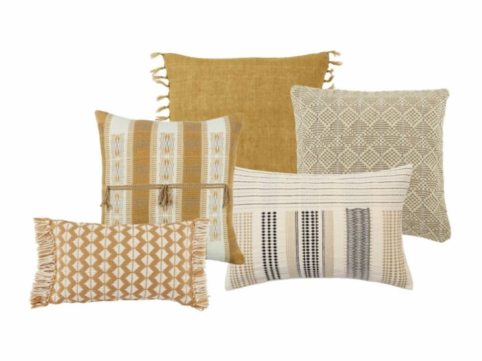
Interior design often uses pattern mixing to evoke specific moods and create a unique atmosphere. A living room with a bold wallpaper featuring a large-scale floral pattern could be complemented by a smaller-scale geometric rug or patterned cushions. The designer might have selected complementary colors from the wallpaper for the rug and cushions, creating a harmonious visual connection while still allowing each element to stand out.
The overall effect is likely a warm and inviting space, balancing visual interest with a comfortable atmosphere.
Graphic Design: Visual Storytelling
Graphic design provides a dynamic platform for showcasing the power of pattern mixing. Consider a poster for a summer festival. A playful, vibrant floral pattern could be used as a background, complemented by a bolder, geometric pattern for the text elements and design accents. The use of contrasting colors and scales would create a sense of dynamism and visual energy.
The designer might have strategically placed the patterns to guide the viewer’s eye through the design, emphasizing key information or a particular message.
Examples: Detailed Case Studies, Designer tips for mixing patterns
| Design Project | Patterns Used | Scale and Placement | Aesthetic Impact |
|---|---|---|---|
| Fashion Dress | Floral and Geometric | Floral small scale on bodice, geometric large scale on skirt | Visually interesting, balanced silhouette, cohesive aesthetic |
| Living Room | Large-scale floral wallpaper, small-scale geometric rug | Complementary colors from wallpaper to rug, cushions | Warm and inviting, balanced visual interest |
| Festival Poster | Floral and Geometric | Floral background, geometric for text & accents | Dynamic and visually engaging, guides viewer’s eye |
These examples demonstrate how successful pattern mixing hinges on careful consideration of scale, proportion, placement, and the intended mood or function of the design. Understanding these elements allows designers to create visually compelling and engaging works that resonate with their intended audience.
Advanced Techniques and Trends
Pushing the boundaries of pattern mixing involves more than just combining different prints. It’s about crafting unique visual narratives, creating unexpected effects, and leveraging current design trends to achieve a truly compelling aesthetic. This exploration dives into advanced techniques, current trends, and the tools that are shaping the future of pattern mixing.Advanced techniques go beyond simple pattern combinations, embracing innovative approaches that elevate the design’s impact.
By understanding these techniques, designers can create truly distinctive and memorable pieces. This includes exploring the use of pattern gradients, incorporating texture, and manipulating color variations to achieve sophisticated and engaging results.
Pattern Gradients and Transitions
Creating smooth transitions between patterns using gradients is a powerful technique. Instead of abruptly switching from one print to another, designers can blend patterns seamlessly, producing a sophisticated and visually appealing effect. This can be achieved through digital tools and software that allow for precise control over the gradient process. For example, a gradient could transition from a bold floral pattern to a subtle geometric print, creating a dynamic visual flow.
Incorporating Texture
The addition of texture to a pattern mixing design can significantly enhance its visual appeal. By layering different textures, such as a rough linen print alongside a smooth silk print, designers can add depth and visual interest. Texture can also play a role in creating tactile experiences, particularly in fabric design. The incorporation of textures can make the pattern mix feel more immersive and engaging.
Unique Color Variations
Exploring color variations in existing patterns is crucial for creating compelling pattern mixes. This involves subtly adjusting the hue, saturation, or lightness of colors in different patterns. This creates a sense of cohesion while introducing visual interest. For example, a designer might use a deep teal color variation in a paisley print to complement a coral variation in a damask print, achieving a harmonious color palette.
Digital Tools and Techniques
Digital tools and software have revolutionized the way designers approach pattern mixing. These tools offer precise control over pattern placement, color manipulation, and texture integration. Software allows for experimentation with different pattern combinations, gradients, and color palettes without the constraints of physical materials.
Emerging Trends in Pattern Mixing
Current trends in pattern mixing demonstrate a departure from traditional approaches. Designers are increasingly exploring unexpected combinations, prioritizing unique and striking aesthetics. A growing trend includes the use of bold and contrasting patterns in unexpected ways. The exploration of unusual color palettes, especially those that seem to defy traditional color harmony rules, are also noticeable.
Table of Recent Trends in Pattern Mixing
| Trend | Visual Example (Description) | Detailed Description |
|---|---|---|
| Bold & Contrasting Patterns | A vibrant geometric print layered over a delicate floral print. | This trend involves juxtaposing strong, bold patterns with more subtle or delicate patterns. The contrast creates a dynamic visual effect, drawing attention to the design’s unique character. |
| Unexpected Color Palettes | A pastel-colored paisley print combined with a deep, rich jewel tone. | This trend moves beyond traditional color harmonies, embracing unexpected and unconventional color combinations. The result is a fresh and captivating aesthetic. |
| Geometric & Abstract Fusion | A complex abstract pattern integrated with a simple geometric print. | This trend blurs the lines between geometric and abstract patterns, creating a dynamic and visually rich composition. The integration of these styles often yields a modern and sophisticated feel. |
| Layering and Overlapping Patterns | A series of different patterns overlapping each other, creating a complex and intricate design. | This trend emphasizes the use of layering and overlapping patterns to create a layered and intricate visual effect. This approach can create depth and a sense of complexity. |
Conclusive Thoughts
In conclusion, mixing patterns effectively is a journey of understanding, experimentation, and mindful choices. By grasping the core principles, you can transform your designs from ordinary to extraordinary. From selecting complementary patterns to mastering layout strategies, this guide provides a roadmap for successful pattern mixing. Remember to experiment, have fun, and embrace the beauty of visual harmony.