


Outdated living room paint colors can instantly make a room feel dated. This exploration dives into the world of dated color choices, examining why certain shades are no longer in vogue, and offering refreshing alternatives to create a modern and inviting atmosphere. We’ll also discuss how current trends are shaping living room color palettes.
From the bold hues of the 1980s to the muted tones of the 2000s, many paint colors have fallen out of favor. Understanding these shifts in style can help you avoid making a similar mistake in your own home. This guide offers practical advice and inspiration to update your living room’s color scheme and create a space that reflects your current style.
Identifying the Problem
Outdated paint colors in living rooms can instantly transport a space back to a bygone era, diminishing its modern appeal. Choosing the right color palette is crucial for creating a welcoming and stylish atmosphere. A room painted in a color that screams “last century” can detract from the overall design and make the space feel smaller and less inviting.
Understanding what colors have fallen out of favor helps homeowners make informed decisions for a contemporary look.A significant factor in recognizing outdated colors is their association with specific historical periods. These colors, while perhaps popular in their time, have since become linked to specific aesthetics that are no longer considered current or stylish. This shift in perception often reflects evolving cultural preferences and design trends.
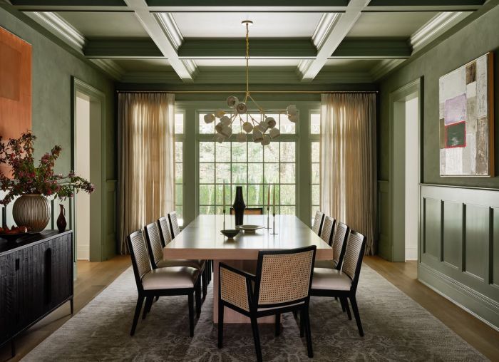
Outdated Living Room Paint Colors
Many living rooms feature paint colors that, while once considered fashionable, now appear dated. A few prominent examples include:
- Deep, saturated jewel tones like emerald green, sapphire blue, and burgundy red, popular in the 1980s and 1990s, can feel overly intense in a modern context. These hues often lack the subtle nuances and sophistication that contemporary palettes offer.
- Muted, beige and cream tones, while seemingly neutral, can sometimes feel bland and uninspired, particularly if they are used extensively throughout the room. They lack vibrancy and contrast that modern designs often embrace.
- Bold, primary colors like bright yellow, orange, and fuchsia, while once seen as energetic, can appear jarring and overwhelming in a contemporary setting. The lack of nuanced layering in these colors makes them less desirable for today’s living rooms.
- Wallpaper with busy patterns or bold prints were common choices in the 2000s, but now often appear outdated and detract from the focus on clean lines and modern aesthetics in contemporary design.
Reasons for Feeling Dated
The perceived outdatedness of certain colors is frequently tied to the overall design aesthetic of the era in which they were popular. The stylistic elements that accompanied these colors are no longer favored. Overly ornate or busy patterns associated with some paint colors contribute to a feeling of datedness.
- Color palettes from the 1970s, often featuring a mix of bold patterns and vivid colors, are now considered dated due to their association with a specific aesthetic.
- The prevalence of certain colors in a particular era might contribute to their association with a specific design aesthetic. For example, the use of dark, rich blues or greens in living rooms during a particular decade might have been associated with specific styles, making them appear outdated now.
Cultural Impact on Color Perception, Outdated living room paint colors
Cultural context plays a crucial role in how colors are perceived. What was considered fashionable in one era might appear dated in another. Design trends and cultural values are always evolving, and colors reflect these changes.
- Color trends are often influenced by global events, artistic movements, and societal shifts. These factors impact the perceived appropriateness and relevance of different colors over time.
- For instance, the use of muted earth tones might have been prevalent during a particular period due to a societal shift toward naturalism or sustainability. Today, this trend might appear dated due to the emergence of new design philosophies.
Examples of Outdated Color Palettes
Various color palettes from different decades have become less popular. These color palettes are now considered less relevant to current design sensibilities. This change in perception reflects the dynamic nature of design trends.
- The use of pastel colors and floral prints in living rooms during the 1950s and 1960s are now considered outdated, as more contemporary designs focus on minimalism and neutral tones.
- The 1980s and 1990s featured jewel tones and bolder colors. Now, a shift toward softer palettes and more subtle colors is prevalent.
- The use of primary colors in the 2000s often felt less sophisticated and more playful than current palettes.
Impact on Mood and Ambiance
Outdated paint colors can significantly affect the overall mood and ambiance of a living room. The wrong color choice can make a room feel cold, stuffy, or even depressing. The correct color choice can evoke a sense of warmth and relaxation.
- The use of dark and overly saturated colors can make a room feel cramped and oppressive, hindering the feeling of spaciousness.
- Conversely, pale and overly muted colors can diminish the sense of vibrancy and energy in a living room.
- Choosing the right color palette can contribute to a feeling of warmth, openness, and comfort, improving the ambiance of the room.
Understanding Current Trends

Repainting your living room is a significant undertaking. Beyond aesthetics, color choices influence the mood and atmosphere of your space. Choosing colors that are not only visually appealing but also resonate with current trends will ensure your living room remains a stylish and welcoming environment for years to come. Understanding these trends allows you to make informed decisions, aligning your home with contemporary design aesthetics.The world of interior design is constantly evolving, and living room paint colors are no exception.
Current trends lean toward a more balanced approach, incorporating both calming neutrals and vibrant accents to create dynamic and inviting spaces. Moving away from overly saturated or dated palettes, modern choices prioritize a sense of harmony and visual comfort.
Popular Living Room Paint Colors
A multitude of colors are currently trending in living rooms. The rise of natural tones reflects a desire for a sense of calm and connection with nature. These include various shades of beige, gray, and white, offering versatility and a foundation for layering with accent colors. Deep blues and greens are also gaining popularity, providing a sense of tranquility and sophistication.
A growing interest in warm, inviting hues like soft yellows and terracotta tones are also evident. The choice often depends on the desired atmosphere and the overall design style.
Comparison with Past Trends
Past living room paint colors often leaned towards bolder, more saturated hues. Deep reds, oranges, and purples were common, sometimes in bold, contrasting combinations. Modern trends, however, favor a more subdued palette. A move toward muted tones and neutral backgrounds allows for flexibility in accent pieces and furniture choices. This shift reflects a desire for spaces that feel calm and inviting, rather than overly stimulating.
Elements of Appealing Current Colors
Contemporary living room paint colors prioritize versatility and flexibility. Neutrals allow for a broader range of furniture and decor choices, while accent colors create visual interest without overwhelming the space. The careful selection of shades helps to establish a balanced and harmonious environment. These colors are often chosen for their ability to adapt to different lighting conditions and enhance the natural light in a room.
Ultimately, the appeal lies in the balance they strike between sophistication and ease.
Psychological Impact of Paint Colors
The psychology of color plays a significant role in shaping the atmosphere of a living room. Warm colors like yellows and oranges evoke feelings of warmth, energy, and sociability. Cool colors like blues and greens create a sense of tranquility, calmness, and serenity. Neutrals, such as grays and whites, offer a versatile backdrop that can be easily adapted to different moods and styles.
Understanding these impacts allows for intentional design choices that reflect the desired mood for the space.
Color Palettes for Contemporary Design
Color palettes for contemporary living rooms often combine a neutral base with carefully selected accent colors. For instance, a living room with a gray base can be complemented by pops of teal, emerald green, or a deep navy blue. A beige backdrop can be highlighted with ochre, terracotta, or a rich gold. The key is to select colors that complement each other and create a cohesive, inviting space.
A well-curated color palette adds depth and visual interest without overwhelming the room’s overall design.
Examples of Popular Palettes
One popular choice is a soft gray base with warm, earthy accents such as terracotta or burnt orange. This creates a welcoming, yet sophisticated atmosphere. Another popular option involves a neutral white or cream base accented with vibrant shades of blue, creating a tranquil and calming environment. These palettes offer flexibility and adaptability, making them suitable for various design styles.
Modern Alternatives
Outdated living room paint colors can feel dated and uninspired. Fortunately, embracing contemporary palettes can dramatically transform the space, breathing new life into your home. Modern design often prioritizes clean lines, neutral tones, and a sense of calm, making these spaces feel both stylish and inviting. These alternatives offer a fresh approach to color selection, considering current trends and the emotional impact of different hues.
Color Palette 1: Earthy Neutrals
This palette focuses on a serene and calming atmosphere, drawing inspiration from natural elements. It’s designed to create a sense of tranquility and connection to the outdoors.
- Base Color: Soft, warm gray (e.g., Sherwin-Williams Agreeable Gray). This provides a neutral backdrop that allows other colors to stand out.
- Accent Color 1: Muted terracotta (e.g., Benjamin Moore’s Revere Pewter). This adds warmth and a touch of sophistication without being overwhelming.
- Accent Color 2: Light beige (e.g., Benjamin Moore’s Simply White). This brings in a touch of natural light and enhances the sense of spaciousness.
This palette is excellent for spaces that want a relaxed, natural feel, ideal for a cozy living room or a space that needs to feel calm and inviting. The soft tones create a sense of harmony and ease.
Color Palette 2: Modern Coastal Hues
This palette evokes a sense of refreshing serenity, reminiscent of coastal living. It’s perfect for creating a breezy and light-filled atmosphere.
Ugh, those avocado green walls in the living room? Seriously outdated. It’s time for a fresh coat, but before you dive into redecorating, consider the environmental impact. Switching to eco-friendly laundry detergents like best green laundry detergents is a great way to start, and it’s a similar principle to choosing paint colors that are better for the planet.
Outdated living room paint colors can be surprisingly tough to live with, so let’s get those walls looking fresh!
- Base Color: Soft, pale blue (e.g., Behr’s Sky Blue). This creates a sense of openness and tranquility.
- Accent Color 1: Light, sandy beige (e.g., Benjamin Moore’s Chantilly Lace). This provides a grounding element, contrasting beautifully with the blue.
- Accent Color 2: Soft, muted green (e.g., Sherwin-Williams Sea Salt). This adds a touch of nature and freshness, tying the space to the outdoors.
This palette is a fantastic choice for creating a coastal vibe. The color combination evokes a feeling of relaxation and rejuvenation, ideal for a space that needs to feel calm and airy.
Color Palette 3: Bold and Playful Accents
This palette embraces a more contemporary and dynamic aesthetic, using bold colors to create a vibrant and energetic atmosphere.
- Base Color: Deep, warm gray (e.g., Farrow & Ball’s Hague Blue). This serves as a neutral foundation for the bolder accents.
- Accent Color 1: Lime green (e.g., Sherwin-Williams’ Seafoam). This introduces a pop of vibrancy and a sense of playfulness.
- Accent Color 2: Mustard yellow (e.g., Behr’s Golden Hour). This provides a cheerful and inviting contrast to the gray base.
This palette is well-suited for spaces that desire a bolder statement. The combination of bold colors creates an energetic and inviting space.
Comparison Table
| Outdated Color | Modern Alternative | Reasoning | Mood/Ambiance |
|---|---|---|---|
| Dusty Rose | Pale, warm gray | Dusty rose is outdated; a warm gray is more versatile and current. | Dusty rose can feel outdated; a warm gray feels modern and inviting. |
| Deep Teal | Muted, calming blue | Deep teal is becoming less prevalent; a muted blue is more contemporary and serene. | Deep teal can feel heavy; a muted blue feels calm and fresh. |
| Bright Orange | Mustard Yellow | Bright orange is considered less modern; a mustard yellow provides a cheerful alternative. | Bright orange can be overwhelming; mustard yellow is cheerful and inviting. |
Visual Appeal and Impact
Outdated paint colors can often make a living room feel dated and uninviting. Choosing the right color palette, however, can transform a space, making it feel more modern, welcoming, and stylish. This involves understanding how colors interact with lighting, the layout of the room, and the furniture and textures already present. The key is to select colors that are both aesthetically pleasing and functional for the specific living room.Modern color palettes often utilize a broader range of hues and shades, moving away from the overly saturated or muted tones that might be associated with older color schemes.
This shift in color preference is influenced by current design trends, with a growing emphasis on creating a space that is both visually appealing and conducive to relaxation and interaction.
Outdated vs. Modern Color Palettes in Living Rooms
A thoughtful approach to color selection involves understanding how different hues affect the mood and atmosphere of a room. Outdated color palettes often used in living rooms can create a stale or even slightly oppressive environment, while modern color palettes create a more contemporary and inviting ambiance. The table below demonstrates how a few outdated color schemes can be effectively modernized with a few strategic changes.
| Example 1 (Outdated) | Example 2 (Outdated) | Example 3 (Outdated) | Modern Alternative (1) | Modern Alternative (2) | Modern Alternative (3) |
|---|---|---|---|---|---|
| Deep, saturated teal walls with a dark brown sofa. | Muted, yellowish-beige walls with a light gray couch. | A strong, almost jarring, crimson red wall with white trim. | A soft, sage green wall with a light gray sofa. | A warm, creamy white wall with a gray-blue sofa. | A warm, neutral gray wall with a terracotta-colored sofa. |
Creating an Inviting and Stylish Space
Updated color palettes can significantly enhance the visual appeal of a living room. For instance, a warm, neutral color palette, like a creamy off-white or light gray, can create a sense of spaciousness and tranquility. The use of soft, muted tones can make the room feel more inviting and relaxing. In contrast, a bold accent wall with a vibrant color can draw attention to a focal point, such as a fireplace or a large window, and create a more dramatic and energetic atmosphere.
It is important to remember that the specific color choices will depend on the individual preferences of the homeowner and the overall style of the room.
Impact of Lighting on Perceived Colors and Mood
Lighting significantly impacts the perceived colors and mood of a living room. Natural light, especially during the day, can change the appearance of colors dramatically. Warm lighting, such as incandescent bulbs, can make colors appear warmer and more inviting. Cool lighting, such as fluorescent bulbs, can make colors appear cooler and more sterile. Using a variety of light sources, such as lamps, pendant lights, and recessed lighting, can help to create a layered and more sophisticated lighting scheme.
The strategic placement of lighting can also highlight specific features of the room and create different moods within the same space.
Considering Size and Layout
The size and layout of a living room are crucial factors in selecting paint colors. In a small living room, light and airy colors can create the illusion of more space. Conversely, darker colors can be used to define different areas or zones within a larger living room. A well-designed color scheme should complement the existing architectural features of the room.
For instance, a high ceiling can be highlighted with a lighter color scheme, while a fireplace can be emphasized with a more dramatic color.
Complementing Color Palettes with Textures and Furniture
Textures and furniture can play a crucial role in complementing or contrasting with different color palettes. For instance, a soft, plush rug can add warmth to a cool-toned living room. A bold patterned sofa can add visual interest to a neutral color scheme. The choice of furniture and textiles should be considered in conjunction with the color palette and the overall style of the room.
The aim is to create a harmonious balance between the colors, textures, and furniture in the space. By carefully considering these elements, a homeowner can create a living room that is both aesthetically pleasing and functional.
Practical Considerations
Choosing the right paint for your living room is more than just aesthetics. It’s about creating a space that’s both beautiful and functional, lasting for years to come. This section delves into the practical aspects of selecting paint, from finishes and durability to budget-friendly options.Selecting the appropriate paint finish significantly impacts the room’s visual appeal and feel. A glossy finish reflects light, making a room appear brighter and more spacious.
Ugh, those outdated living room paint colors! They scream “1990s,” and frankly, they’re a bit of a mood killer. Switching to something fresh is a great way to upgrade your space, but before you start painting, remember that some kitchen tools, like your wooden spoons and whisks, are best kept spotless by hand washing. This helps prevent bacteria build-up and ensures they last longer.
For a comprehensive list of tools you should always hand wash, check out this handy guide: kitchens tools you should always hand wash. Ultimately, a fresh coat of paint can completely transform the room, just like a clean kitchen.
Conversely, a matte finish absorbs light, providing a more subdued and intimate atmosphere. Understanding these differences allows for a more tailored approach to achieve the desired ambiance.
Ugh, those avocado green living room walls are just screaming “2010s.” Sometimes, even though you’ve got a great plant collection, like a lovely snake plant, why is my snake plant drooping could be a sign that your plants are subtly protesting the outdated color choices in your living room. Maybe it’s time to consider a fresh coat of paint that reflects your current style?
A neutral tone or a bold accent color could breathe new life into the whole space.
Paint Finish Selection
Paint finishes vary in their sheen and reflective qualities, influencing the overall appearance of a space. A high-gloss finish, for instance, can make a room feel more modern and sophisticated, but it also highlights imperfections. A satin finish provides a good balance between durability and visual appeal. Matte finishes, while less reflective, can hide imperfections better and offer a more relaxed feel.
The choice of finish should align with the desired aesthetic and the room’s intended use.
Durability and Stain Resistance
Durability and stain resistance are critical considerations when choosing paint for a high-traffic living room. Living rooms are often exposed to wear and tear, from accidental spills to everyday use. A paint with good durability will withstand these stresses, minimizing the need for frequent touch-ups and extending the life of the paint job. Similarly, stain resistance prevents unsightly marks and spills from becoming permanent fixtures.
Choosing a paint with high stain resistance is crucial for maintaining the room’s aesthetic appeal over time.
Paint Brand and Type Selection
Selecting the right paint brand and type is important for achieving the desired look and feel while ensuring longevity. Consider factors such as the specific needs of your living room (e.g., high traffic, exposure to sunlight) when making your choice. A premium brand often correlates with higher quality ingredients and better performance characteristics. Understanding the paint type—latex, acrylic, or oil-based—is essential.
Each type has its unique properties in terms of durability, washability, and drying time. Different paint types suit different environments and needs.
Durable and Stain-Resistant Paints
Choosing a paint with high durability and stain resistance is vital for a long-lasting and attractive living room. Several reputable brands offer such options. Examples include Benjamin Moore, Sherwin-Williams, and Behr. Within these brands, specific paint types are known for their stain resistance and durability. For example, Sherwin-Williams’ SuperPaint is known for its excellent durability, while Benjamin Moore’s Aura paint is often praised for its stain resistance and low-VOC formula.
Budget Considerations
Budget planning for a living room painting project is crucial for a smooth and successful execution. Consider the cost of paint, labor, and any additional materials like brushes, rollers, and drop cloths. Estimate the total area to be painted to determine the appropriate amount of paint needed. Professional painters usually charge by the hour or per square foot.
Factor in these costs when creating your budget. Consider purchasing in bulk or choosing a more economical paint option, while still maintaining quality. Compare prices from different retailers and contractors to find the best deal. For example, a gallon of premium paint might cost $50-$75, while a gallon of a mid-range option could cost $30-$40. Similarly, labor costs vary depending on the complexity of the project and the location.
This information can be used to plan the project and manage expectations effectively.
Space and Style Integration
Choosing paint colors for your living room is more than just aesthetics; it’s about creating a space that reflects your personality and complements the overall style of your home. The right color palette, combined with thoughtfully chosen furniture and lighting, can transform a room from ordinary to extraordinary. Understanding how these elements interact is key to achieving a harmonious and inviting living space.Integrating space, style, and color effectively requires careful consideration of the architectural features of your home and the desired ambiance.
The existing architectural style, whether modern, traditional, or transitional, sets the stage for the color choices. Furthermore, the furniture and lighting you select will amplify the impact of the paint colors, creating a cohesive and visually appealing living room.
Living Room Styles and Suitable Color Palettes
Different living room styles call for different color palettes. The overall aesthetic of the room should dictate the choice of paint colors. For instance, a minimalist living room benefits from neutral or soft tones, while a bohemian space might embrace warmer, earthier hues. Understanding these connections will help you make informed decisions.
Impact of Architectural Style on Color Selection
The architectural style of your home significantly influences the choice of paint colors. A craftsman-style home, with its exposed beams and intricate details, might be enhanced by warm, natural tones like deep browns and earthy greens. A modern, minimalist home, on the other hand, often benefits from cool, neutral tones that allow the clean lines and architectural features to stand out.
Matching the paint color to the architectural style ensures visual harmony and enhances the home’s unique character.
Incorporating Furniture and Décor
Furniture and décor elements play a crucial role in complementing the chosen paint colors. For example, if your living room walls are painted a soft gray, consider adding furniture pieces in warm wood tones or rich blues to create visual interest and depth. Adding accent pieces, such as throw pillows or rugs, can further enhance the color scheme and create a more personalized feel.
The goal is to create a balance between the paint colors and the furniture and décor.
Selecting Lighting Fixtures
Lighting fixtures are essential for enhancing the chosen paint color. Warm-toned lighting can make a room feel cozier and more inviting, while cool-toned lighting can create a more modern and airy feel. Consider the size and shape of the room when selecting lighting fixtures, ensuring adequate illumination without overwhelming the space. Different lighting can dramatically change the way a paint color appears.
Table of Living Room Styles and Color Palettes
| Style | Color Palette | Furniture Suggestions | Lighting Recommendations |
|---|---|---|---|
| Modern Minimalist | Neutral (Gray, White, Black), Soft Pastels | Clean lines, simple shapes, light-colored woods | Sleek, modern pendant lights, recessed lighting |
| Traditional | Warm Neutrals (Cream, Beige, Taupe), Deep Earthy Tones | Rich fabrics, ornate details, dark wood furniture | Chandeliers, sconces, table lamps with warm bulbs |
| Bohemian | Earthy Tones (Terracotta, Burnt Orange, Olive Green), Warm Neutrals | Rattan furniture, patterned rugs, macrame wall hangings | Pendant lights with warm tones, string lights, lanterns |
| Coastal | Light Blues, Soft Greens, Whites | Light-colored wood, wicker furniture, nautical accents | Coastal-inspired lanterns, pendant lights, natural fiber shades |
Practical Application
Transforming your living room from outdated to on-trend involves more than just choosing a fresh color palette. The practical application of painting requires careful planning, precise execution, and attention to detail. This section details the steps, techniques, and considerations to ensure a smooth and successful repainting project.Preparing the surface for a fresh coat of paint is crucial for a long-lasting and aesthetically pleasing finish.
Ignoring this step can lead to uneven coverage, paint bubbling, and premature peeling. The preparation process should include thorough cleaning, patching, and priming to ensure the paint adheres properly.
Preparing the Living Room for Repainting
Thorough preparation prevents many potential issues. Cleaning the walls removes dust, dirt, and loose debris, ensuring a clean surface for the paint. Patching any holes or cracks in the wall is essential to prevent paint from seeping into these imperfections. Use a suitable patching compound, allow it to dry completely, and sand it smooth before priming. Priming the walls creates a uniform surface and helps the paint adhere more effectively.
This step significantly improves the paint’s longevity and prevents issues like bubbling or peeling. Different types of primers are available, so selecting the right one for the wall type and paint is crucial for optimal results.
Painting Techniques for Visual Effects
Various painting techniques can elevate the visual impact of your living room. A smooth, even coat is the standard, but techniques like rag rolling, sponging, or stenciling can create unique patterns and textures. These techniques can be used for adding depth and dimension to the walls, or to create a focal point within the room. Rag rolling, for example, produces a slightly textured effect that adds visual interest without sacrificing the smooth appearance.
Sponging allows for more pronounced patterns, while stenciling can create intricate designs that fit specific styles.
Choosing the Right Shade of Color
Selecting the right shade is crucial for achieving the desired ambiance. Before buying paint, gather samples of the colors you’re considering. Using paint chips on the wall allows you to evaluate how the color interacts with the natural light in your room. Consider the size and layout of the living room. For smaller rooms, lighter shades can make the space feel more spacious.
Conversely, bolder colors can add depth and character to larger rooms. Consider the existing furniture and decor. The colors of your furniture and other accessories can influence your choice of paint color.
Applying Paint Evenly and Smoothly
Applying paint evenly and smoothly is essential for a professional-looking finish. Use high-quality paint rollers and brushes. Use the correct brush size for the surface area being painted, and ensure the roller is properly loaded with paint. Begin painting in the upper corners of the room and work your way down, overlapping each stroke to avoid visible lines.
Apply thin, even coats to prevent drips and runs. Allow each coat to dry completely before applying the next. Maintain a consistent stroking direction for a smoother finish.
Achieving a Flawless Finish
A flawless finish requires careful attention to detail. Ensure all coats are thoroughly dry before sanding. This helps remove any imperfections and ensures a smooth surface for the next coat. Sanding can be done lightly to remove minor imperfections. Use fine-grit sandpaper for a smooth, polished finish.
A final coat of paint, carefully applied, creates a seamless, professional finish. Proper ventilation is essential during the painting process to allow the paint to dry quickly and prevent health hazards.
Last Word: Outdated Living Room Paint Colors

Choosing the right paint color for your living room is a significant decision. By understanding the evolution of living room color trends, you can make informed choices that will enhance your space for years to come. This guide has provided a framework for assessing outdated colors, exploring current trends, and introducing modern alternatives. Remember to consider the specific style of your living room, the overall mood you want to evoke, and the practical aspects of paint application when making your final decision.